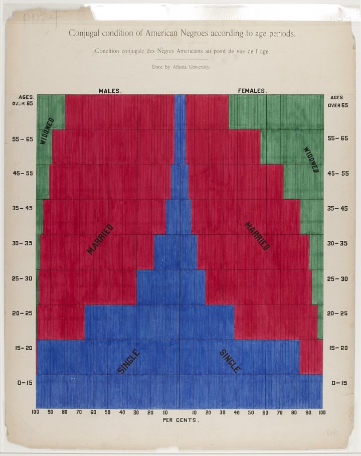
In 1900, W. E. B. Du Bois and his students drew a series of charts for The Exhibit of American Negroes. They’re not all winners, but these were hand-drawn in 1900, so there’s some leeway there. There are also a handful of graphics that use graphic devices that we sometimes mistake for modern methods, like cartograms to compare values and a bent bar graph to allow smaller values some space on a zoomed-in axis.
The stacked bar graph above, which shows marital status by age, struck me especially because I made a similar chart for the current population. I am like, so 1900. [via @michalmigurski]


