Bestiario, the group behind 6pli and a number of other network projects, released their most recent project – Canvi & Temps – that explores the complexity of science since the early 1920s.
The first part, Temps, is two linked charts stacked on top of each other. On top are individual articles and on bottom are tags that provide context to those articles. You’ll probably be tempted to read the visualization as a stacked area chart, but that wouldn’t quite work. Bar height doesn’t really mean anything other than there were more articles or tags in a year when the bars are small. Instead, color indicates count. Roll over an article and see the related tags over time or vice verrsa.
It reminds me a lot of Bestiario’s earlier Atlas of Electromagnetic Space.
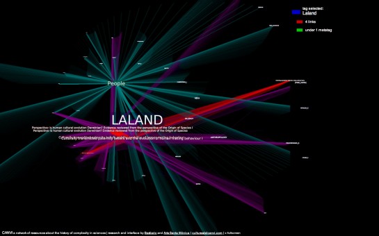
Then there’s Canvi, which is a network view of tags and links:

I’m not completely sure what I’m looking at with Canvi. It’s more artistic expression than utility, I think. From the Bestiario blog:
The uniqueness of Canvi lays in the fact that it explores new node positioning techniques as well as their spatial relations. In particular Canvi combines different techniques (geometric paradigms) subtly alternating between nodes and their relation. This means that the representation of the network is in constant movement (a breathing sort of movement), this way offering a broader perception of the local network.
Yeah, I’m still not sure, but it’s nice to look at. Ideas anyone?
[Thanks, Jose]

 Visualize This: The FlowingData Guide to Design, Visualization, and Statistics (2nd Edition)

I don’t even know what’s going on with the first visualization. If it takes more than a couple of minutes to digest what I am supposed to make of the visualization, it loses any effectiveness for me.
Canvi has some applicability and looks nice but it makes me seasick.
I guess that’s the main idea though (er, not the seasick part) since it is an exhibition at Arts Santa Monica in Barcelona.