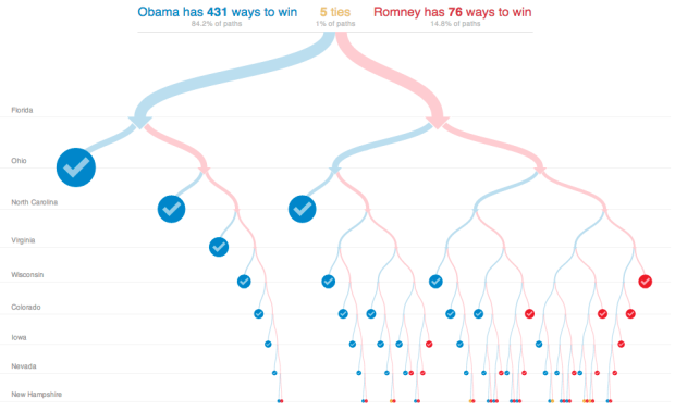
With the election tomorrow, Mike Bostock and Shan Carter for the New York Times map the 512 possible paths to the White House. Select state wins, and the paths update accordingly. For example, select an Obama win in Florida, and it doesn’t look good for Romney.
If Mr. Romney loses Florida, he has only one way to victory: through all the other battleground states. He has led most polls there, however, and is the favorite. If Mr. Romney wins Florida, he has 75 paths open to him.
The interaction feels game-like.


How do they do that? That would be useful for so many things…
Anyone know what it is called? Decision tree?
It’s just a pretty flow chart that splits at every decision point.
I imagine it’s based on binomial probabilities, it looks like a kind of binomial tree
When I made something like this recently, I called it a decision tree.
Choose a name depending on how grand you’re feeling. Want it to sound simple and low key? “Interactive flow chart”. A little more grand? “Decision tree”. Pretentious as hell? “Graphical algorithm”.
Like almost all NYTimes graphics, it’s a custom-made thing built on top of the javascript library D3.
On the page, it’s an iframe pointed at http://www.nytimes.com/newsgraphics/2012/10/12/electoral-calculator/7feadbc7606af9ce0e5d242e1ba75fd53717da7d/iframe.html which contains the actual graphic, if you want to dissect it and see what it’s made of.
You can sometimes get insights into the NYT graphics team’s working processes at their tumblr, http://chartsnthings.tumblr.com/
This is a cool, useful, simple, profound … graphic! Sums up the end game. Will be my scoring sheet for Tuesday evening.
That’s an excellent graphic. Should be required viewing for all the pundits who can’t quite figure out what Nate Silver’s probabilities are conveying.
I thought it was a shame they didn’t merge the two. For example, they could have had it so that when you click, hover or move down to a new junction, a popup info box on the side gives you a paragraph of profile text and the trend chart from the 538 swing state tracker ( http://elections.nytimes.com/2012/swing-state-tracker ).
Or the intersection itself could have had some little indication of size and swing – something simple, clear and unobtrusive, like by shade of purple or a little p** ch**t showing swing where total area is linked to number of electoral college votes, or a small simple 2-line column chart with 50% marked, or something similar. (please not a single bar split in two – those things have all the problems of pie charts without the obvious half and quarter points, people only use them because they are afraid of breaking the pie taboo)
I liked this chart, but I felt it leaned too heavily on prior knowledge. If you didn’t arrive at it already having an idea of which way each state was swinging, you’d feel like you were clicking around at random. It would be a good candidate for an optional second layer of information that could be ignored by people who don’t need it, or dug into by people who do.