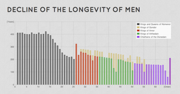
Driven by his love for Lord of the Rings, Emil Johansson explores the many facets of the world in charts and graphs. For example, the above chart is the declining lifespan of man.
It is explicitly stated by Tolkien that the longevity of Men once granted to the Númenóreans decreased over the years. In Letter 156 Tolkien writes that “a good Númenórean died of free will when he felt it be the time to do so”. With the Shadow and the Downfall of Númenor this grace was taken away from them and they died involuntarily with a decreasing lifespan.
The decreasing life span is seen clearly in the graph. The most dramatic change is shortly before the Downfall of Númenor. The rulers are shown in order. Their number should not be confused with how many generations from Elros Aragorn is since there were more than one line of rulers.
There’s also a geographic map of where characters traveled, a family tree, a timeline, and even an Android app. I think Johansson might be a superfan. A hunch.


 Visualize This: The FlowingData Guide to Design, Visualization, and Statistics (2nd Edition)

The stacked colums make some kind of sense here – unlike this example: http://lotrproject.com/statistics/#raceandsex cited by David at http://www.informationisbeautiful.net/2012/lord-of-the-rings-demographics-visualized/?utm_source=feedburner&utm_medium=feed&utm_campaign=Feed%3A+InformationIsBeautiful+%28Information+Is+Beautiful%29&utm_content=Google+Reader.
Maybe in LOTR men are male and female as one figure insists – although the pie chart contradicts the fantasy somewhat!