Have you ever rushed to the airport only to find that your flight was delayed or canceled?
In the most recent Data Expo at the annual Joint Statistical Meetings, data heads explored 120 million departures and arrivals in the United States, with the goal of finding “important features” such as:
- When is the best time of day/day of week/time of year to fly to minimise delays?
- Do older planes suffer more delays?
- How does the number of people flying between different locations change over time?
- How well does weather predict plane delays?
While there were several interesting entries, here are the first, second, and third place winners.
First Place. Congestion in the Sky by Rick Wicklin and Robert Allison
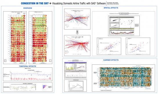
This was a comprehensive view of flight delays, but here’s the part I found most interesting. This is a view of flight cancellations. The more red a rectangle is, the higher the percentage of cancellations:
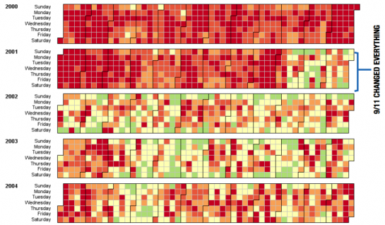
So following 9/11 there were actually fewer cancellations (and delays). My best bet is that this was because there were so few people flying after that event. Conversely, the longest delays occur during the summer and winter holidays.
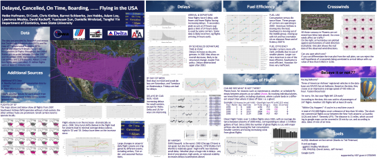
Second Place. Delayed, Cancelled, On-Time, Boarding … Flying in the USA
This poster is from the Iowa State crew – one of my favorite stat groups – led by Heike Hofmann and Di Cook.
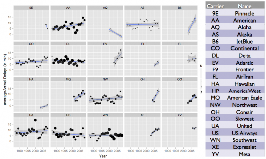
Here are delays over time by carrier. Delays are increasing for small carriers except for Aloha, and Delta and US Airways are improving, surprisingly I might add.
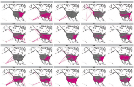
And here’s where all the carriers fly. Can you guess the carrier that each map belongs to without looking at the key above?
Third Place. A Tale of Two Airports by Charlotte Wickham
Instead of looking at it all, Charlotte explored flight traffic at Oakland International and San Francisco International.
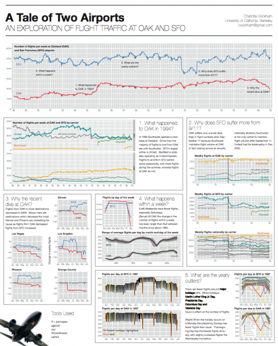
Here are the flights per week from SFO (top) and OAK (bottom):

What’s with the jump for OAK in 1994? Southwest started flying outta there and now makes up the majority of outgoing Oakland flights.
Want to see more?
Visit the data expo page to see the above posters and all other entries in their full PDF glory. Very interesting work all around.

 Visualize This: The FlowingData Guide to Design, Visualization, and Statistics (2nd Edition)

Interesting post. I really like the data set. I’ve spent my share of time circling Atlanta.
On the view of flight cancellations in the first place graph: Fewer people flying would likely lead to more cancellations, wouldn’t it? Airlines would cancel because they can’t fill the plane. If they don’t have a target number of fliers, they aren’t making money on the flight.
One other possible reason for the shift could be that there were fewer flight to cancel. My wife travels for work and I remember many airlines cutting back on flights at certain times of the day after 9/11. Specifically their evening flights. So rather than catching a Thursday night flight home, she had to wait until Friday morning.
ah, right, that’s what i meant, fewer people = fewer flights, but i guess that’s not always true.
Pingback: The impact of 9-11 on flight traffic « Smart People I Know
I wonder why is the quality of graphic images embedded on your posts always so poor?
they’re usually screenshots, so you should visit the actual sites to see the high-res versions
Is there a place where we can download this data?
Sean, you can get all the data here:
http://stat-computing.org/dataexpo/2009/the-data.html
or you can get the most up-to-date data direct from RITA:
http://www.transtats.bts.gov/OT_Delay/OT_DelayCause1.asp
thanks Nathan. I really appreciate the link.
-Sean
Pingback: ×תרי שדות תעופה: 10 דוגמ×ות למופת « UNTITLED -|- מחשבות ×•×ž×¢×©×™× ×¢×œ עיצוב ו××ž× ×•×ª