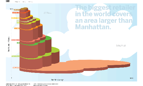
Speaking of Walmart, if we took all of the Walmarts in the world and clumped them all together, they’d cover Manhattan (with some stores sinking in the water). Walmart is the bottom bubbles; McDonald’s is represented by the second from the bottom set.
I’m slightly surprised that McDonald’s doesn’t cover more. Although, I guess Walmart stores are pretty big compared to McDonald’s restaurants. I’m not really surprised that Walmart area is greater than Manhattan area though. In fact, I thought it would have been more with all the Walmarts in the world. Hmmm…
Into the Artistic Section
As for this graphic, well, if it were supposed to be statistical, I’d say I didn’t I like it. It’s not meant to be statistical though. The goal is to show that Walmart is humungo. I get the graphic’s main point, which is… the point. To that end, I couldn’t care less about proper scales, utility, and what not. Take it for what it is and enjoy.
This Walmart graphic goes in the artistic section of viz, opposed to the pragmatic side (as Robert explains). There are three other graphics similar in feel to this one that cover sugar consumption, student debt, and solar power.


 Visualize This: The FlowingData Guide to Design, Visualization, and Statistics (2nd Edition)

Pingback: A Magazine Dedicated Entirely to Visualizing Something Useful