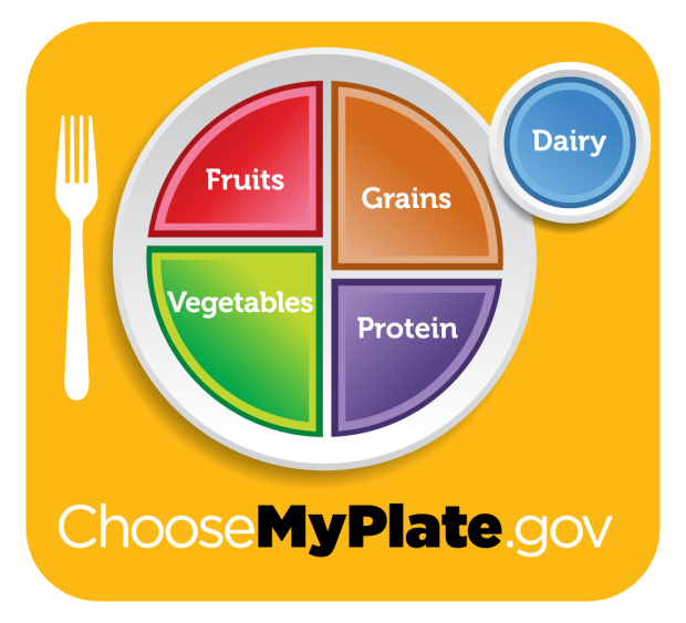
In an effort to decrease obesity and improve general health, the US government announced their newest guide to food proportions: the food plate. This of course is a departure from the food pyramid that has been around in one form or another since the 1990s. Instead of slivers or sections on a pyramid, we now have a pie chart type of thing. Well, more like a Simon.
So here’s the question: Does the plate work better than the pyramid?
Or how about better than designs past, from the 1970s?

 Visualize This: The FlowingData Guide to Design, Visualization, and Statistics (2nd Edition)

imho absolutely yes. the dish gives a clear and “real” intuition of the suggested proportions. Searching on google images for “daily food plate” you find also some other visualizations.
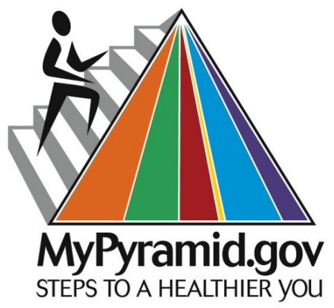
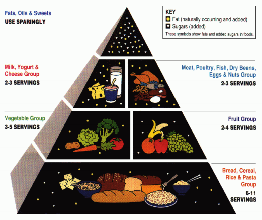
To answer the question, yes, the foot plate works better for the pyramid. Much better. There are big problems with the food pyramid. First is the fact that the hierarchy doesn’t work at all. Sweets are kept to a minimum but somehow get placed at the top – the apex – the focal point – of the diagram while the items we’re supposed to consume the most are relegated to the bottom. I understand that this was meant to imply serving size (or servings per day) but I feel that the pyramid diagram seriously fails in that way.
The plate is simple and extremely easy to understand because it is so intuitive. The abstraction of servings is removed and we have a literal representation of what our meals should look like…on a plate. You cant boil away anything from the new diagram because it has already been stripped to the essentials.
Food plate >> Pyramid
So I work in obesity prevention research and the food pyramid has been a running joke for about 20 years. The plate is a big step forward I think, in almost every way, though not perfect. Marion Nestle has a good breakdown: http://www.foodpolitics.com/2011/06/san-francisco-chronicle-column-food-plate-of-course/ . Graphically, I think it’s an improvement as well though I would have played around with the font colors – don’t like the white text on colored background.
http://i.imgur.com/sN0yA.png
The food plate is much better – mostly because it may lessen the consumption of processed grains.
I couldn’t agree more, Mike. In fact, my family has been learning a lot about the Paleo Diet and I’m even questioning how much we should consume grains or dairy, if at all.
To answer the question at hand, though, yes the food plate is much more clear than the pyramid.
I recommend checking out http://www.reddit.com/r/keto/. There’s a bunch of great information there regarding a low carb diet (ketogenesis).
I disagree. About all you can get from the plate version is that you should eat each of the five types of food. If there is proportions involved, only the dairy is different than the others. Maybe a little less protein and fruits.
There are some other visualizations, but they are not for the same data.
The plate is better than the pyramid, but I believe we can do better.
Whoops, i forget this isn’t Facebook/Twitter. Please see my reply below.
Meh. Even the old inaccurate Four Food Groups model would be an improvement over the way Americans *actually* eat. Changing targets every decade just leads people to think “oh those government busybodies can’t even decide what’s healthy, so they’re probably just wrong.”
The educational problem here isn’t one of information or visualization, but of a realization how far off any kind of healthy diet most of us actually are. The plate is purely aspirational for adults who eat zero helpings of vegetables a day.
For my money, the government couldn’t much improve on Pollan’s maxim.
Also, it’s hard to square these USDA dietary advice things with the interests involved in their production. For example, dairy is not only not necessary, for many adults (the lactose-intolerant kind) it’s an outright irritant.
@David: I guess you’re right. Now that I look at it again it is a misleading pie chart. I doubt you will ever see an honest representation of proportions though if big food companies have anything to do with it.
The food plate uses a lot of blocky ink to convey five words. The colors are arbitrary, unless I’m to eat watermelons, purple meat, and blue milk. The sizes are also arbitrary. The pyramid had problems, but at least it was trying. Seriously, what does this abomination add over: ‘fruits, grains, vegetables, proteins, dairy’?
Even ‘FRUITS, VEGETABLES,GRAins, Proteins, dairy’ conveys more information through capitalization.
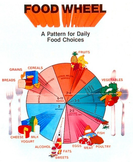
One option would be the 1970s food wheel, with the areas reflecting the suggested number of servings. Of course, a bar chart would be more effective.
Another option would be to word cloud, and use colors for different groups, along with the relative sizes.
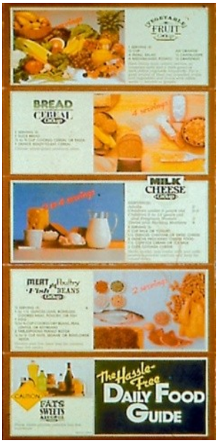
My favorite part of the 1970s food plate is how proper place settings have clearly become less important.
It’s been mentioned already, but my first thought on the plate was that I wished it was an actual pie chart. I think the idea is supposed to be 50/50 fruits+veggies and grains+proteins, but on first glance it really just looks like all the portion sizes are approximately the same.
It’s still flawed by one small and one fundamental problem. The small problem is that the it mixes protein, carbohydrates, and fat with 4 four food groups. Teaching individuals about what is and what is not a protein can be difficult especially since dairy provide crossover. But that small problem is dwarfed by the fundamental problem. All of these are put out by the Department of Agriculture not the Department of Health and Human Services. Until that changes, they’re all crap.
All government diet advice is horrible–just look at the health of the population. The obesity and diabetes “epidemics” aren’t a result of people being unable to understand the Pyramid, they’re a result of people *following* the pyramid.
Graphically, the Plate is better because it’s simpler, but by not labeling the portions consistently (where’s the Protein section of the supermarket?) it’s less effective than it could be.
BTW, for good diet advice google for Mark’s Daily Apple.
I don’t know that the obesity epidemic is because anyone is following the food pyramid…. who actually thinks that way when they eat a meal? It’s more because so much food that isn’t so healthy for us is so readily available and inexpensive (super-sizing and free refills). We were taught the food pyramid in school in the 70s (I don’t remember that wheel at all) and it keeps morphing around depending on new studies and new catchwords. I do like the plate graphic better because it is more relevant and easy to understand – especially for a child – though it is still very abstract. Showing various combinations of foods on plates would be even easier to understand. I mean would we really be filling the WHOLE plate up no matter what protein/fruit/veggie/grain combo we used – probably not. Sometimes though we do ask a bit too much of a single graphic – the obesity problem won’t be solved by this or any graphic, since as many commenting here have pointed out, there are quite a lot of factors contributing to the problem. Awareness does help and it’s certainly a step in the right direction. I think the plate is more straightforward and is a shift in thinking compared the decades old food pyramid.
The food wheel lists alcohol so I’m going to have to go with that.
But seriously, the plate is a great idea – clear and simple. Unfortunately I agree with some of the comments here that it won’t do much to sway fat Americans into changing their eating habits. Everyone’s already eating everything on the plate chart, the problem is they’re eating unhealthy amounts and forms of it.
Perhaps a more effective chart would be logos of major fast food chains with “do not” circles over them.
The problem isn’t fast food chains. Watch the documentary “Fat Head”, which busts that myth pretty nicely.
Reducing portion sizes would help, but if that entails hunger and the reliance on willpower to overcome it, it’s doomed.
No, the real problem is the Government’s anti-dietary-fat crusade and Big Agribusiness’ promotion of grains–with the Government’s help, of course. And Big Pharma and the medical industry are raking in huge bucks as a result, too. The cards are all stacked against the lowly consumer.
I was surprised that the “food plate” received such a warm response. I didn’t actually get anything from it, other than that I’m supposed to eat 5 different food categories as part of every meal. I also got confused by “grains” vs “proteins” because I eat lentils, quinoa which fall under both. I also cannot tell if I should eat more vegetables than grains, or if those two pieces of the plate are the same size.
this is the downfall of pie charts because it’s hard to REALLY get an accurate reading from the pieces in relationship to each other. I put it on our fridge for my husband (a meat and potatoes man) and wrote short lists of examples of each type of food next to it. Perhaps this type of example would have been good to include. Not everyone knows where an egg falls, or a potato, or quinoa. Is tomato a fruit? Etc.
The plate is much easier to comprehend at a glance, but what’s protein? Don’t we get protein from foods (including foods in the four named food categories) rather than eating it as a purified chemical category?
The plate should be sorted food categories or chemical categories, rather than mixing them together. If protein is on there, so should carbohydrates, salt, fat, water, and so on.
Absolutely first rate and copper-bottomed, getlneemn!
F1dYAl oscwpuxrwcph
Not a fan. Pie charts are pretty much the worst way to deliver information, unless you are pointing out a difference in magnitudes. I’d be laughed out of the building if I tried to pass a chart like this at work.
It ain’t $2 million better.
It’s also just a slightly tweaked version of the “Power Plate” produced by the animal rights propaganda group PCRM. See http://www.pcrm.org/news/blog/archive/usda_food_plate_drbarnardsblog_110602.html and http://en.wikipedia.org/wiki/PCRM
Not worth two cents, much less $2 million.
I think the food plate is better than the pyramid because it gives contextual size relationships to the audience, making it easier for someone at each meal to visualize what is missing or what they have too much of. I printed it and put it on my own fridge because my husband has a hard time giving himself and our son enough vegetables.
As far as what I think of it from a data designer perspective… My own practice is to never as a first choice use pie charts because I believe the data can be framed so/too easily. I don’t like to leave that hole for argument to slip through when displaying data. However, if I’m trying to manipulate a story, yes, a pie chart is one of my best tools.
The food plate is easier on the eyes than the ugly “revised” pyramid — which completely destroyed the pyramid metaphor by grouping the categories next to each other instead of on top of each other — but it still suffers from a very fundamental problem.
Looking at the food plate image, would you be able to tell me whether how much more protein you should have in your diet than dairy, or even if you should have more protein than dairy?
Oh, sure, you can eyeball it — but in order to tell me with any certainty, you’d have to calculate the area of a circle and then compare it to the area of 1/4 a circle.
In case you’re curious, the dairy circle has a radius of 60 pixels, so an area of 11310 pixels.
The protein quarter-circle has a radius of 145 pixels, so an area of 16513 pixels.
That means the protein shape has an area that’s about 146 percent greater than the dairy shape.
Could you have guessed that simply by looking at the image?
Now, the designers of this graphic may argue that they’re not trying to strictly represent the comparative recommended values of the food groups.
But why not? If you’re going to have a food proportion infographic, why not try to represent the actual recommended proportions as precisely as possible?
In case you’re curious, here’s how some other countries have tried to visualize recommended food group portions:
http://www.grantlovellette.com/2011/02/interesting-useless-and-awful-food.html
I love the link to other nations’ food guides – I was impressed with how often the pyramid shape is used.
Thanks for including that link Shaun!
For my own purposes, I found this new pie-chart-with-dairy-satellite entirely incomprehensible. I have no real way to compare one size foodgroup to another, much less to the orbiting dairy moon. At least when I had X# recommended servings per day, I knew at each meal whether I was on track or not. For this… gads.
That said, if you want to make your first million, here it is: make and sell plates that have those little sections (like kids’ plates) according to the ratios in this new diagram. Of course, since we’re Americans, you may need to build in a vertical constraint as well (read: lid above which one cannot stack 15 more hamburgers, or “proteins”).
I really wonder how the latest pyramid was approved. Like someone signed off on that and was like yes, this is a great way to show Americans what to eat. It’s the most non-sensical graphic ever and I don’t see how it tells us anything about what we should be eating. The previous pyramid did a better job.
Having said that, the plate is obviously a much better representation. I guess we could argue forever about what should be on it (grains and dairy is questionable, healthy fats are missing), but it actually gives people a visual of what a typical meal could look like, at least much more so than past attempts.
I think the “half a plate of fruits and vegetables” is a nice idea that people need to hear. They should have a slideshow or something showing some typical portion sizes for healthy meals.
Interesting to see that alcohol disappeared in time. It was present in the last 2 (by name or via a bottle) but is completely absent afterwards. Is alcohol prohibited in the US once more?
My favorite is the 3rd: the pyramid with servings. It gives a good idea of what the BASE of the alimentation should be (even if the “top” of the pyramid can be misleading by its positive connotation).
We worst is the second: the pyramid sliced vertically. What the heck??
The plate is not much better IMHO. Is “dairy” larger than “fruit”? Aren’t dairies full of proteins?? Is “protein”=”fruit” and “vegetables”=”grains” (if so, why are they put in this order)?
NONE of the images stick in my mind enough to be useful, but I still remember a catchy little “Four, four, three, two” jingle about food-groups servings from elementary school in the 1970s.
Did the pyramid have a catchy jingle to go with it? Does the plate?
I’m a family doctor. For the last year I’ve been using this tool from WebMD with my patients: http://www.webmd.com/diet/printable/portion-control-size-guide
Maybe the moderator could add it to the pictures above. The plate, with real food on it and real portions compared to everyday objects below is the best tool I’ve ever used. Everyone gets the composition message- eat a variety of foods, more veggies, etc. What most people don’t get is that portions should be much smaller.
The cartoonist view…
http://www.denverpost.com/keefe/ci_18242174