Just about everywhere you go there’s something in the news about swine flu, and so naturally, when I first heard about it, I waited for The New York Times to put up a graphic. That was the first one. Here’s the second (above).
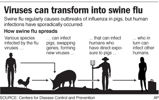
Nicolas Rapp from AP also provides this explanation of how swine flu spreads:

Finally, if you’d like to take a look at the data yourself, the Guardian Data Store provides a full list of swine flu cases by country and by date.
[Thanks, @datavis]

 Visualize This: The FlowingData Guide to Design, Visualization, and Statistics (2nd Edition)

What gets me is the weirdly high death rate in Mexico. What this map DOESN’T show is that 20 (maybe 160) people have died there but nowhere else…
Pingback: The Best Sites For Learning About The Swine Flu Outbreak | Larry Ferlazzo's Websites of the Day...
Pingback: It’s what designers do … | GCOMDRE@SCC
Is it me or are bubble plots overlaid on maps misleading? The size of the circles don’t convey anything when the regions they represent (states, countries) are of different area size or, especially, population density. It’s especially confusing when the circles cross the area’s boundaries (Mexico’s bubble reaches into Oklahoma). Wouldn’t it be better to just color-code the affected regions by frequency (e.g., darker color), and perhaps, in this case, normalize the counts to population density? I suppose that map-overlaid bubble plots might be more useful when looking at component areas of comparable sizes or populations densities, such as cities or counties, but that’s also misleading given how varied population densities are in different regions.
Pingback: More Info On Swine Flu (Including Student-Created Resources) | Larry Ferlazzo's Websites of the Day...
I JUST HOPE WE CAN EXPORT IT TO PAKISTAN N SAUDI ARABIA
Pingback: Daily Research » Shared Items - April 28, 2009
I generally like the bubble plots visually. But in this case it is confusing when the circles overlap other regions. And what happens as the cases grow? the scale will have to change or the circles will encompass the whole map and that might be confusing.
I put up some swine flu tracking charts myself and plan to update these daily. Not nearly pretty enough but I think they convey the right information in an intuitive way. I will try to work on the format a bit tonight when I update it and perhaps come up with a combined chart. Let me know what you think.
http://www.cavemanforecaster.com/2009/04/swine-flu-tracking-charts.html
But if the bubbles don’t overlap from Mexico to the US how does the swine flu promote the necessity of closing our borders?
Pingback: Simple Complexity » Blog Archive » Tracking Swine Flu Cases Worldwide: Interactive Infographic
I track the spread at http://www.swineflutrackingmap.com
It has a couple of maps and other helpful info and news.
Hope this thing just fades away.
Here is an interesting visualization tracking Swine Flu spread, featured by New Scientist:
http://www.newscientist.com/projects/misc/video?bcpid=1896802502&bclid=1904732932&bctid=21819053001