I’ve said it before, and I’ll say it again. If there’s anything good that has come out of the financial crisis it’s the slew of high-quality graphics to help us understand what’s going on. Some visualizations attempt to explain it all while others focus on affected business. Others concentrate on how we, as citizens are affected. Some show those who are responsible. After you examine these 27 visualizations and infographics, no doubt you’ll have a pretty good idea about what’s going on.
Visual Guides to the Financial Crisis
Let’s start things off with some comprehensive guides to the financial crisis. Several of these are from GOOD magazine’s recent contest to make sense of it all.
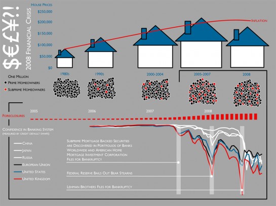
2008 Financial Crisis by Carolyn Aler and Sam Conway
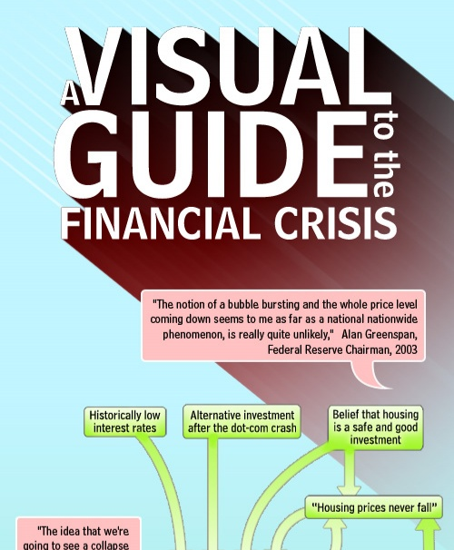
A Visual Guide to the Financial Crisis by Jess Bachman
Jess from WallStats put this together for the Mint blog. I’m pretty sure they have him on retainer.
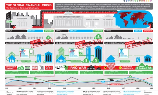
The Global Finanical Crisis by Cypher 13
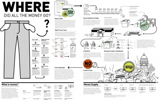
Where Did All the Money Go? by Emilia Klimiuk
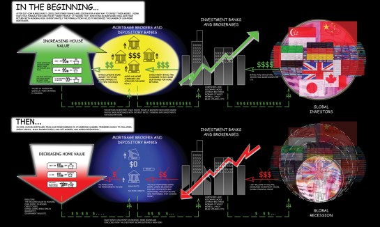
From Feliciano Rahardjo
Looks like the beginning of a comic book.
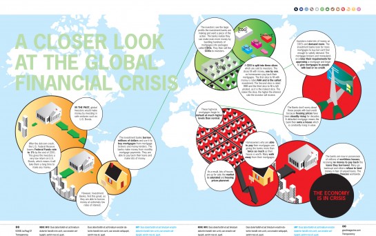
A Closer Look at the Global Financial Crisis by Liam Johnstone
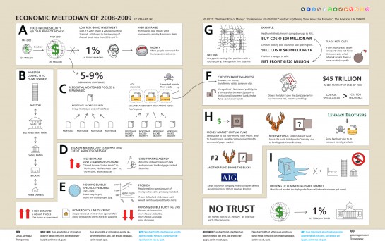
Economic Meltdown of 2008-2009 by Pei San Ng
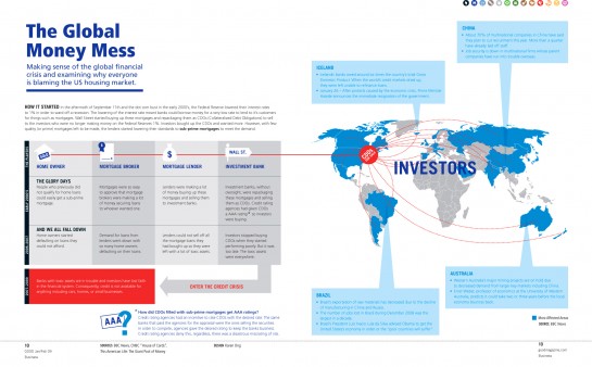
The Global Money Mess by Karen Ong
Crisis of Credit Visualized by Jonathan Jarvis
We saw this one a few days ago in animated form.
Stimulus vs Bailout Plans
OK, now that we have an idea of what’s going on here, let’s take a look at the stimulus/bailout plans. The government is handing out a lot of money. Where’s it all going and when?
Bailout Tracker by The New York Times
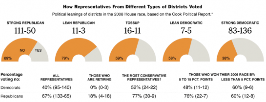
Congressional Voting on the Bailout Plan by The New York Times
Gotta go through a lot of voting before deciding whether or not to spend $700 billion.
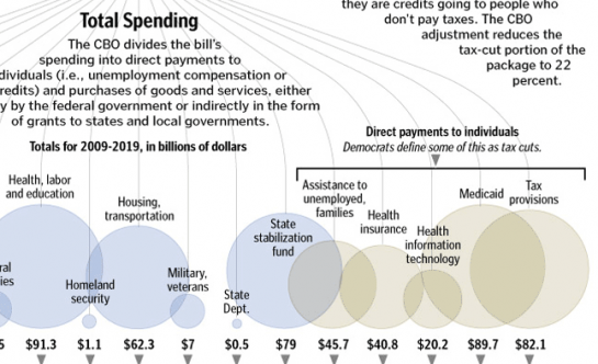
Total Spending by The Washington Post
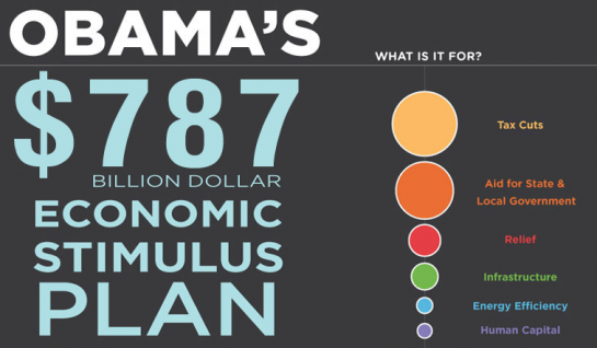
Obama’s $787 billion Dollar Economic Stimulus Plan by CreditLoan
Bubbles, bubbles, and more bubbles.
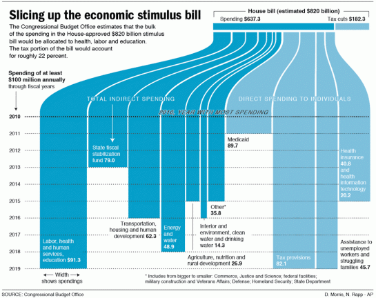
Slicing Up the Economic Stimulus Bill by Associated Press
Recovery.gov from Obama Administration
The Obama administration seems to understand that it’s important to provide information to the public.
Effects on Business
Will the bailout do any good? What effect has the current state of the economy had on big business?
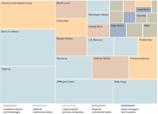
Map of the Market by The New York Times
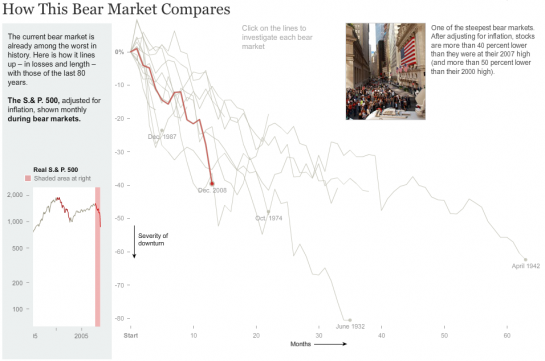
How this Bear Market Compares by The New York Times
Making Sense of Problems at Fannie and Freddie by The New York Times
Golden Parachutes by Jess Bachman
The Fall of GM by Jess Bachman
The Cost of Bailing Out AIG via Many Eyes
Effects On the Individual
Enough about business. How are you affected?
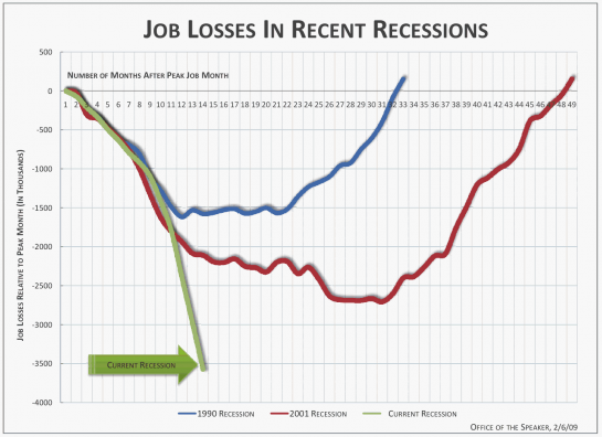
Job Losses in Recent Recessions by Time Magazine
Visualizing Money
Right.org
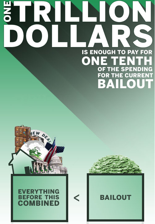
One Trillion Dollars by Mint and WallStats
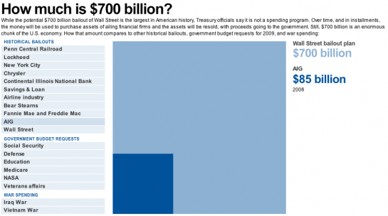
How Much is $700 billion? by USA Today
What Does One Trillion Dollars Look Like from PageTutor
Looks at Past Recessions
The best way to prepare for the future is to look at what was done in the past.
How the Government Dealt with Past Recessions by The New York Times
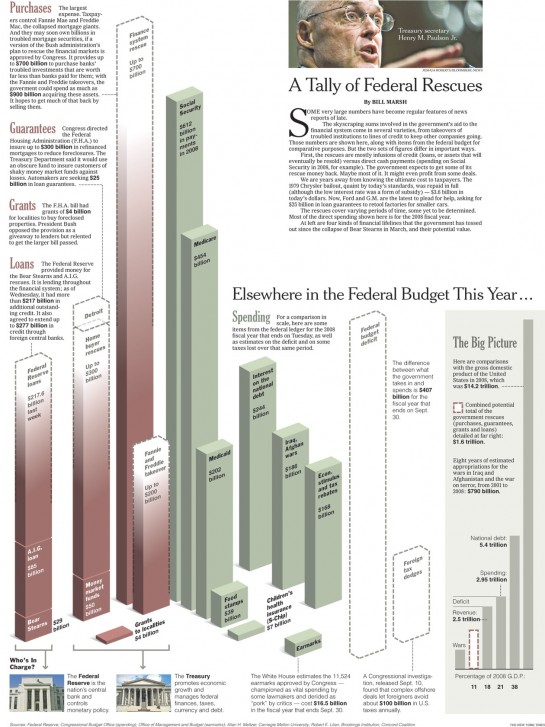
A Tally of Federal Rescues by The New York Times
See. I told you that you’d understand a this financial crisis a little better. Did I miss any other stellar graphics?









 Visualize This: The FlowingData Guide to Design, Visualization, and Statistics (2nd Edition)

Pingback: Küresel Mali Kriz > Nahnu.Org
Very, very nice Post and Impressions.
Please, give more Tips for Visualization-Online-Tools and Tutorials for Data-Mining and Data-Visualization.
Pingback: Forex Forex Forex Forex - Forex Learn
Pingback: SCVTalk.com » Blog Archive » Friday the 13th - Daily Brief
Excellent stuff Nathan…one stop-shop for all financial crisis visualisations
Nice round up. Its fun to see such a huge an important data set hit the net and the viz community, pro and am a like take it apart and do their thing. The sheer variety is good to see too, with only the government putting out the standard pie chat.
Pingback: Great visualizations on financial crisis « Mutant Ideas
Pingback: ThickCulture » Visualizing the Dep/Recession
Pingback: links for 2009-03-13 - Kevin Bondelli’s Youth Vote Blog
Pingback: 27 formas alternativas de visualizar e entender a crise.
One graphic is incorrect.
“What Does One Trillion Dollars Look Like from PageTutor”
Click the image, you will see that this page shows the graphic for one *billion* dollars, in fact, one *trillion* dollars is 1,000 times larger.
The correct image has much more impact, I hope you will correct this.
Pingback: Sexy Tennis » Blog Archive
Pingback: links for 2009-03-13 at DeStructUred Blog
Pingback: links for 2009-03-13 « Mandarine
Pingback: Analytics Team Blog » Blog Archive » 27 Visualizations of the financial crisis
Pingback: Friday, March 13, 2009 | shiner.clay
These are really great. I think my favorite is the trillion dollar one, which looks even better when you see all the slide together.
Pingback: Aaxei’s Blog
Pingback: 27 Visualizations to Understand the Financial Crisis (PICS) :: peter+media
Pingback: Links from Friday, 13. March 2009 at nathanhollis.org
Pingback: Zach Wise » Daily Digest for 2009-03-13
Pingback: Visualizations of the Financial Crisis « Thomas Arendt’s Blog
Pingback: 27 Visualizations to Understand the Financial Crisis (PICS) « Trader Aaron’s Weblog
Pingback: The Finance Mess with Graphics «
Pingback: 27 Visualizations and Infographics to Understand the Financial Crisis « Digital Woo
Wow, bookmarked! Some great eye candies. Thanks for the compilation.
Pingback: Die besten Internetfotos vom 14.03.2009 - Zuhal.de
Pingback: Interesting visualisations of the crisis « Musings on the world - Life is BUT interesting!
Pingback: 27 gráficos para entender la actual crisis económica. | Comunidad en la Red
Pingback: for the lexically imapired « The Nazarean Candidate
Pingback: CompareOnlineTrading.net - Blog » Blog Archive » 27 Visualizations to Understand the Financial Crisis (PICS)
Pingback: Simple Ways to Understand Financial Crisis « K-Log Blog
Pingback: Links for 3.14.09: Tom Waits, meltdown charts, Mary-Louise Parker… « the listenerd
Bookmark! this will be helpful.
Pingback: Graphical Guide to Financial Crisis - Typology Central
Pingback: Visual Guides to the Financial Crisis | learningIT
Pingback: dekay.org » links for 2009-03-15
Pingback: Visualizations of the crisis
Pingback: Economic Visualizations « Real Estate For Fun and Profit
Pingback: #Wirtschaftskrise - Wie stelle ich mir eine Milliarde vor? « ttt - tourismus technik trends
Pingback: Daily Research » Shared Items - March 15, 2009
Nice collection, but your missing the hilarious infographic/parody on The United States Credit Score
http://www.creditloan.com/blog/uncle-sams-credit-score/
Pingback: Visualizações e infografias « Infografia em base de dados
These graphics are good but they do not reference the legislation which resulted in Fannie Mae and Freddie Mac sub prime mortgages. The U.S. Congress mandated a certain percentage of loans would be subprime to a particular demographic. Any banks who wanted to make a Mae or Mac backed loan had to participate in the subprime scheme as per requirement of the U.S. government.
The government thought it would be a good idea to make home loans to people who could not afford them so that they could suffer a debt they cannot afford. Brilliant.
Pingback: Close your eyes. Visualise a great depression. - First Drafts - The Prospect magazine blog
Pingback: Making Data Visual | Lessons Learned
Pingback: daniel fienes weblog » Blog Archive » fiene & fr
The tools that say “$8+ trillion bailout” are totally meaningless. That’s perhaps what we would technically be on the hook for if the entire economic system were wiped out. And if it were all wiped out, well, I don’t think we’d be worried about people attempting to collect on it, or even really counting in U.S. dollars….
Pingback: Desculpe a Poeira » Blog Archive » Infográficos que ajudam a entender a crise
Jonathan Jarvis’ video explaining this is outstanding. Great work.
Pingback: kurz notiert, 16.03.2009 « Gedankensolo
Pingback: Gotta post this VisURL… Pictures worth Many Thousands of Words… and less Pedantic too! « The Adventures of the Invisible Hand
Pingback: 2reson8 » Blog Archive » Financial Graphics - Inspirational Tidbits
Pingback: Speeliking « Webismo
Pingback: 27 Visualizations and Infographics to Understand the Financial Crisis « Daily Truth Pills
Pingback: 金èžæµ·å˜¯çš„Information Visualization | thedemos
Pingback: ΓÏαφήματα για την παγκόσμια οικονομική κÏίση
Pingback: Finanzkrise in bunten Bildern - Doku-Hotline - Birgit Grossmann über Texte, Technik und technische Dokumentation
Pingback: 27 economic downturn charts, graphs and infographics
Pingback: 27 Infografiken zur Finanzkrise - blog.infografiker.com
Pingback: Shambollocks! // The pump don’t work ’cause the vandals took the handle
too bad emilia klimiuk can’t spell. made for an unpleasant read in an otherwise stunning set of illustrations.
Pingback: FutureGov » Useful links » links for 2009-03-18
Pingback: preclectic.com » Good Money After Bad
Pingback: Financial Crisis visualized | Jan Willem Tulp's blog
Pingback: Crisis of Credit « Angela Yee’s Blog
Pingback: I see… « (Roughly) Daily
Pingback: great visualizations of the great economic fry-up « alex gallafent
Pingback: The visual credit crisis « The Aesthetic Elevator
Pingback: I see… « Scenarios and Strategy
Pingback: „Leere Taschen – Wo ist all das Geld hin?“ auf karrierebibel.de – Jeden Tag mehr Erfolg!
Pingback: DesignNotes by Michael Surtees » Blog Archive » Link Drop (3·20·09)
Pingback: NAGGEN.DE
Wow, bookmarked! A great work. Super graphics. Thanks for the posting. Best Regards BodoHL
Pingback: 27 Visualizations to Understand the Financial Crisis « Information Design at Penn
Very helpfull to understand the current economic situation
Pingback: The week in links 20/03/09 - Craig Baldwin's Blog
Pingback: A New Birth of Freedom | Spirit/Water/Blood
Pingback: MarksterBlog » 27 Visualizations and Infographics to Understand the Financial Crisis
Great compilation of visualizations – I’m always amazed how graphics and their designers are able to distill complex information into byte-size gems!
Pingback: Visual Culture » 27 Visual Guides to the Financial Crisis
Pingback: Gráficos para visualizar la crisis económica | Stralunato
Pingback: Financiële crisis in beeld « De nieuwe reporter
Pingback: 27 schitterende visualisaties van de kredietcrisis - Sargasso
Excellent collection of infographics.
Pingback: DRAW ME A PICTURE - The Public Interest : WTVC Newschannel9.com
while the graphics look very good, some definitely need some sort of perspective, especially the ones closer to the end of the post. while the bailout has been significant in its size, comparing is to previous bailouts while ONLY adjusting for inflation is misleading – inflation is not the only adjustment variable. a $700bn bailout in a $15tr economy is large, but ignores the fact that the bailout is also spread out over two years. even assuming that it would be over one year, it is only 5% of the all of GDP. in 1970, the bailout would have needed to be only $150bn to be comparable in size to $700bn (both adjusted for inflation) to make it a fair comparison. in addition, here the bailout is not going to one company, but to a sector. in addition, spreading the bailout for two years (as expected) would only make it 2.5% of total economy size
you can argue that the bailout is ineffective and unfair, but i don’t see any reason to cause fearmongering only because it is difficult to quickly make inter-temporal comparisons.
Pingback: Tuesday, March 24, 2009 « Rising in Phoenix
Pingback: Gonzo Weighs In and the Signal to Noise Ratio Improves « jss books
Pingback: Charts & Graphs & Flowcharts, Oh My! : duh pookie
Pingback: InfografÃas sobre la crisis financiera | Agroblog
Pingback: Visual Aids anyone? The Econopocalypse in pictures! « The Porphyrogennetos
Pingback: links for 2009-03-25 – Innovation in College Media
Pingback: Artistic Data | alex j. mann (.com)
Pingback: Little Red Riding Hood Animated In Infographics Style By Tomas Nilsson | JazJaz
Excellent, very useful to show people how this crisis developed. Can we discuss the possible way out too
It’s lose, not loose, Emilia
Interesting presentations. Now, how to do we get out of the crisis?
Pingback: Por qué ha petado la economia para dummies. « Hermoso dÃa…
Pingback: Non-fiction | The cult of crisis coverage
Pingback: VT2500: Computer Illustration (Spring 2009) » Blog Archive » More infographics
Pingback: A crise…em motion graphics? «
Pingback: 27 Ways to Untangle The Financial Crisis « The State of the Union
Pingback: » links for 2009-03-28
Wow! What a perspective. I think I understand the cause of this crisis much better now
Pingback: Bookmarks for March 24th through March 30th at James Powell’s Blog
Pingback: Joe’s Home Page .com - A Weblog for Joseph Villalobos » Blog Archive » 27 Visualizations to Understand the Financial Crisis (PICS)
Do any of these mention de-regulation of the banking industry under the Graham-Leach-Bliley amendment, or the Financial Services Modernization Act? Or GATT, NAFTA, and WTO?
It’s de-regulation and the Libertarian myth of the ‘free-market’ that has caused all this.
Until we start addressing these issues, and returning to FDR style social-democracy, the economy will continue to suffer.
Pingback: links for 2009-03-31 « Embololalia
Pingback: Recursos per a la crisi | Zaragozame.com
Pingback: Reader: April 1, 2009 « updownacross
Pingback: Tracking Disaster How to Survive a Worldwide Financial Depression
Pingback: Tema recurrente del momento: la crisis
Irresponsible Govt. , Wall St. and Man’s greed brought us here.
Exemplary illustrations.
Pingback: another, !!! >love suzy< « www.andwelove.com by: suzanne & alexander
Pingback: Este … « Din Romania si pretutindeni …
Pingback: Gr
Pingback: 27 Visualizations and Infographics to Understand the Financial Crisis « Blog about Stats
Pingback: Subprime: The Housing Crisis in 3D | Brain Pickings
Pingback: Fang Found This - 27 Visualizations and Infographics to Understand the Financial Crisis
Pingback: 27 Visualizations and Infographics to Understand the Financial Crisis - Burbuja Econ
Pingback: 27 Visualizations to Understand Financial Crisis
Awesome graphics I often wonder the back and forth that must happen to get them looking so good.
Pingback: Blogs that you actually liked! - Ajarn Forum - Living and Teaching In Thailand
Pingback: Attack of the Infographics! « CartoonSmart.com Blog
Pingback: dontblogme » Infographics
Pingback: Week 6 - Monday « Digital Journalism
On our site maptube we have a number of maps of the financial crisis which are crowdsourced through the BBC with viewers keying in their locaton and answering various questions – our server than scanning the database every half hour and producing a map of quesiton responses – you are wlcome to add this to the list of stuff if you think it relevant
here is the link – but you can overlay maps etc on this site too
http://www.maptube.org/map.aspx?mapid=325
Pingback: Functional Limits » The Allosphere - a blog by Anne-Marie Viola
Pingback: C-SPAM: Where the economy at?
Greta info, thanks. I’m trying to find a video I saw on the BBC website in which a man used an individual earning £15K to demonstrate what the credit crunch means proportionally. Does anyone recognise this description? Can you help me locate it? A link would be wonderful. Thanks!
Pingback: Visualizations and Infographics to Understand the Financial Crisis at ting
Pingback: 27 Visualizations and Infographics to Understand the Financial Crisis | FlowingData @ Triceratops Tone
Pingback: | The Boomerang Table : The Blog of 160over90
Pingback: Info graphics are my new favorites at .to my future self.
Pingback: O melhor da infovis « Infografia em base de dados
Pingback: Reports from the Economic Front » Blog Archive » The Unpredictability of Life
Pingback: Guide to Finding Visual Link bait: Social Media Art and Community Creativity « Nashville SEO | Ethical SEO | Christian SEO and Social Media Agency
Pingback: We’ve Been Duped By Wall Street; It’s Time To Fight Back | PowerMax.com
Pingback: visualizations and infographics to understand the financial crisis at ting
Pingback: Los mayas y la crisis « Datanalytics: estadística y minería de datos
Pingback: Dan Barton