MIX Online, a community of designers and developers, released Project Descry – a series of four open source web-based visualizations.
Ever wonder what goes into building an effective visualization? Look no further. We decided to roll up our sleeves and explore the topic. We’re calling it Project Descry.
Project Descry demonstrates the power of data and information visualization as a communication tool. As a part of Descry, we are releasing a set of open source, web-based visualizations and an article written by the Jon Udell that serves as a broad introduction to the topic.
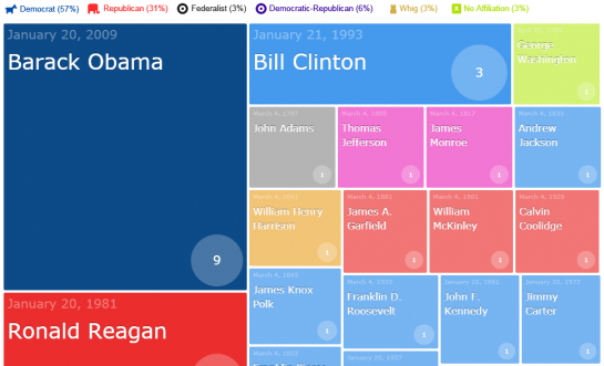
There is one that covers obesity in America from 1987 to 2007 (above) and another that explores words used in inauguration speeches:

The last two show the process of making a website and your social timeline on FriendFeed. All excellent work by the Descry group. Take a look and explore for yourself and then download the visualizations to get your learn on. Also, don’t forget to read Jon Udell’s accompanying article on visualization for the noosphere.


About the obesity data visualisation : What is the advantage of this graph ?? I thought visualisation should help you to easily understand the overall trend.
Which is the tendency in the data graphed that you see from the graph ?
A mere rank order of bars would do have done a better job.
The word count visualisation does a far better job for distinguishing the more talkative from ht erest. But in the middle ground this sort of graphs doesn’t help much to better understanding.
I agree with Frank’s comment. The shirts are just cutesy and obscure real trends in the data.
If the shirts showed the median weight of an individual in each state, and the graphical depiction approximately matched what a person at that weight would look like, then one might be able to argue that the shirts serve some real function (i.e. relating the numbers to something tangible in the physical world).
As is, I think this is a classic case of what Tufte would call a “duck” (Google it if that last line doesn’t make sense)
The obesity shirts could’ve gone more quantitative with a time series, but I don’t think that’s what they were going for. I think it was more of an experiment (in design), and since they made the code available, others can fiddle too.
My old standard for visualisation is old: Otto Neurath and the Wiener Bilderstatistik, from the 1920s/30s. A heavy person would get 1 belly for every 10 kg, and a small one for say every 2 kg. Every child understands this, and if every child does every adult will, too.
See http://wordsarepicturestoo.wordpress.com/about/isotype-a-history-of-the-stick-figure/
But maybe this is not enough sophisticated ?
@Frank and @Dave, Thank you for your feedback. @Nathan’s assertion is correct, it was one of our design goals for this particular infographic to purposely stay away from basic charting and move to the more creative end of the data visualization continuum and represent the data in a visual compelling way. I agree with you, our approach does not convey information as efficiently as a line or bar chart, but the emotional reaction it would invoke, we felt, would have been less effective. The “The Obesity Epidemic†has been the most popular of the four visualizations. To hedge ourselves, we did include the obesity rates ordered by state and highlighted appropriately as a table at the bottom of the page.
The question that we wanted to answer was “What is the ongoing national obesity trend?†So, if for example you sort the visualization alphabetically by state name and select the 25-30% BMI highlight; as you drag the slider from 1987 to 2007, you will see states become selected (dark) and the prevalence of the epidemic becomes quite apparent and foreboding. We feel that the infographic conveys this fairly well and a bar chart doesn’t really convey a “maximum†value as effectively as a tee-shirt that approaches roundness.
We know that there are many other ways that this infographic could be represented, and we had a fair amount discussions around this, and so had to settle on one idea eventually. As @Nathan commented, the code is available on CodePlex and we encourage people to download the code and play with it by adding new dimensions, or modify the way the it is represented visually.