Cartography of generative AI

Oct 20, 2025

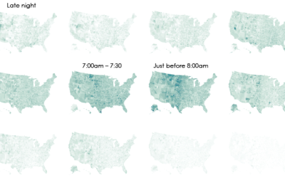
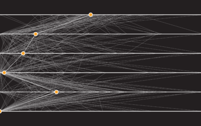
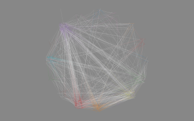
It’s very easy to ignore what happens before and behind-the-scenes when you enter text into a chatbot and hit enter. A response spits up instantly. However, it takes a lot of bits, energy, and people to make that happen. A cartography of generative AI by Estampa shows the groundwork.

Become a member. Support an independent site. Get extra visualization goodness.

See What You Get

Favorites

Visualizing the Uncertainty in Data

Data is an abstraction, and it’s impossible to encapsulate everything it represents in real life. So there is uncertainty. Here are ways to visualize the uncertainty.

Cycle of Many, a 24-hour snapshot for a day in the life of Americans

This is a 24-hour snapshot for a day in the life of Americans.

Who earns a higher salary than you and the jobs they work

Is your salary high, low, or somewhere in the middle? What do people with higher salaries than you do for a living?

The Best Data Visualization Projects of 2014

It’s always tough to pick my favorite visualization projects. Nevertheless, I gave it a go.