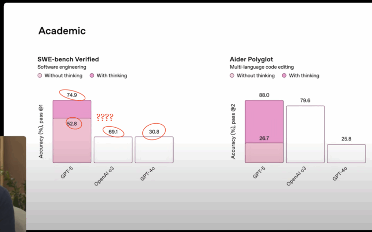
OpenAI introduced GPT-5 in a livestream, and they used a set of seemingly straightforward charts for benchmarks. The point was to show the improved performance of GPT-5 over previous models. However, the labels do not remotely match the bar heights.
The bar for 69.1% is the same height as the one for 30.8% when the former should be more than twice the height of the latter. The bar for 52.8% is taller than the one for 69.1%. It’s off.
Catch the chart at 5:00 in the presentation below:
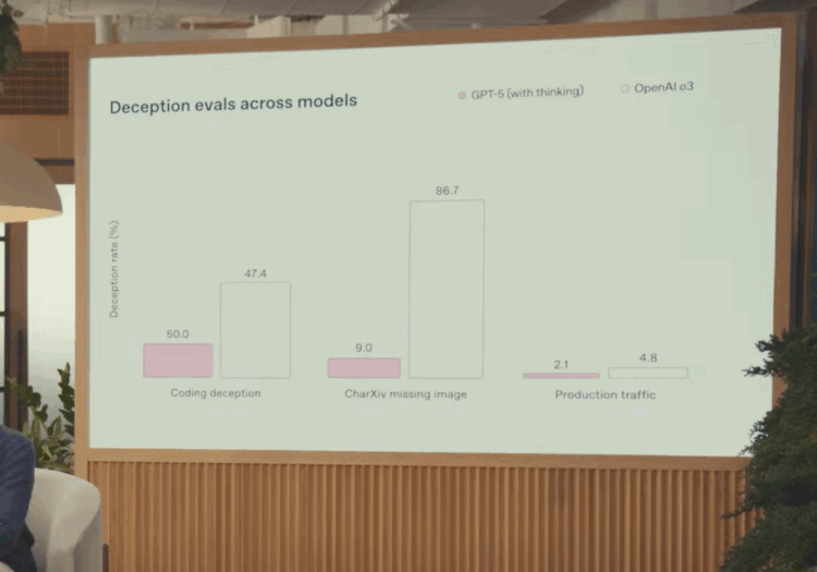
The chart at 30:30 (on deception of all things) is also not great, as the bar for 50.0 is shorter than the one for 47.4:
They don’t say if the charts were made with ChatGPT, but of course it’s not the best look to use a botched chart when talking about the accuracy of a tool that requires high user trust.