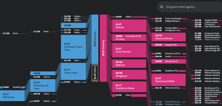
In case you’re wondering about government spending and budgets, USAFacts has a Sankey diagram that shows the money that came in during 2024 and how the revenue was distributed.
According to data from U.S. Treasury Department, $4.9 trillion came in mostly through taxes and $6.8 trillion went out. The difference, $1.8 trillion, contributes to the deficit. It will be interesting to see what this diagram looks like after this year is done (if the data exists).


