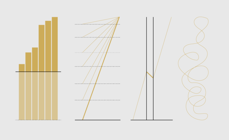
Charts are a window into the world. When done right, we gain an understanding of who we are, where we are, and how we can become better versions of ourselves. However, when done wrong, in the absence of truth, charts can be harmful.
This is a guide to protect ourselves and to preserve what is good about turning data into visual things.
We start with chart anatomy; then we look at how small changes can shift a point of view; this takes us to misleading chart varieties; and we finish with reading data and next steps.


