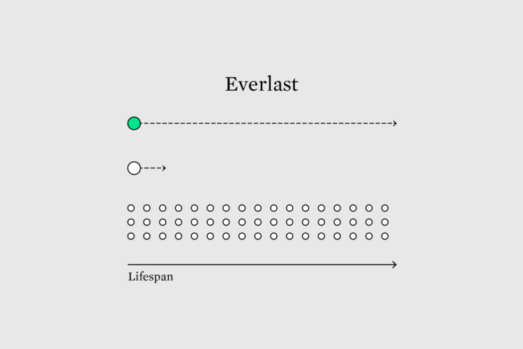
Hi, it’s Nathan. This is the Process, the newsletter for FlowingData members where we talk about making charts that show more than defaults — because it’s the only thing that will separate us from the machines during the uprising. Visualization quality is often measured by speed and efficiency, which leads to temporary and fleeting presentation work. Maybe we optimize for longevity and see what happens.
To access this issue of The Process, you must be a member. (If you are already a member, log in here.)
The Process is a weekly newsletter on how visualization tools, rules, and guidelines work in practice. I publish every Thursday. Get it in your inbox or read it on FlowingData.
You also gain unlimited access to hundreds of hours worth of step-by-step visualization courses and tutorials, which will help you make sense of data for insight and presentation. Resources include source code and datasets so that you can more easily apply what you learn in your own work.
Your support keeps the rest of FlowingData open and assures the data keeps flowing freely.


