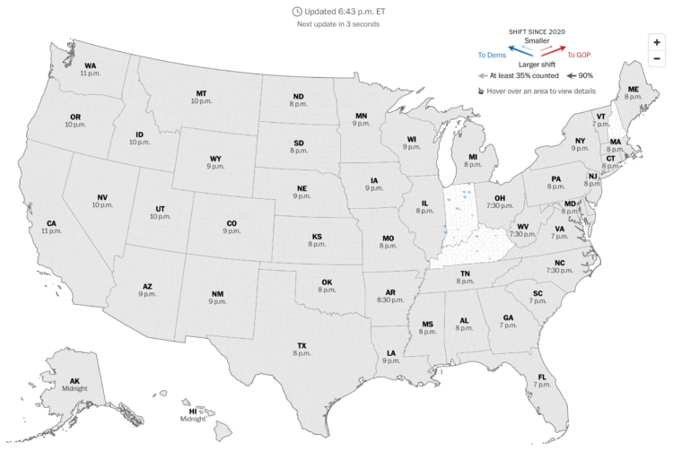
The Washington Post has a live county map that shows the shift towards Democrat or Republican compared to the 2020 election. It updates every 30 seconds.
Angled arrows show the magnitude and direction of the shift. A larger arrow represents a larger shift and a left or right direction represents a shift to Democrat or Republican, respectively. Color reinforces the direction.
They also have these pendulums to show the swings in broader categories:

I like the metaphor.
As of this writing, it’s still early, so there’s not much to see yet, but it could be interesting to watch as more polls close.


