Hey, it’s Nathan Yau. This is The Process, the weekly newsletter for FlowingData members. We look at the many ways to visualize data and how design choices can change a message and interpretation. I’m a little early this week. Given the topic and situation in Florida, I’m making this issue public.
Hurricane Milton is moving towards Florida and expected to make landfall this evening.
If you are in Florida, I hope you and your family are staying safe. The Washington Post has a visual guide on what to do before, during, and after a hurricane. Maybe it’s useful?
As an onlooker on the west coast, I’ve been following the storm through different views. The same data can be visualized in different ways to help people analyze the situation or to show what is happening in a time of confusion.
Literal views
The more literal views minimize abstractions between data and reality. Less abstraction makes interpretation easier.
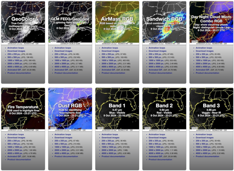
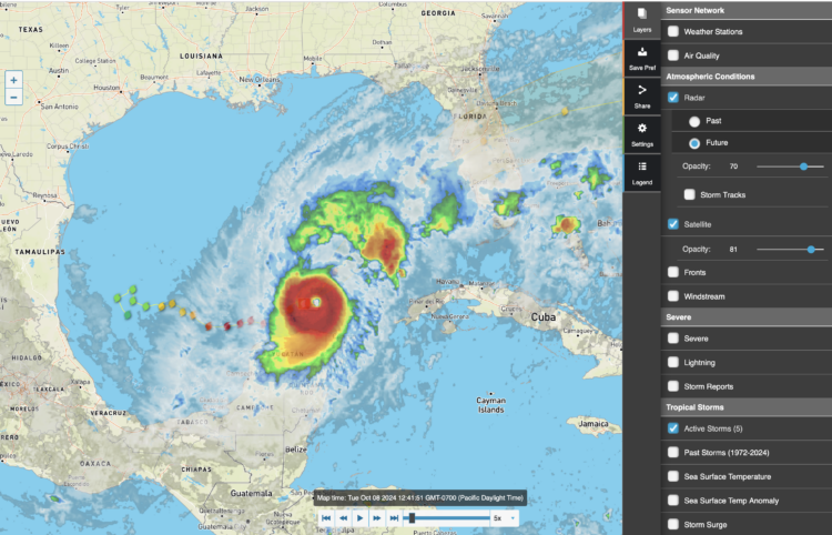
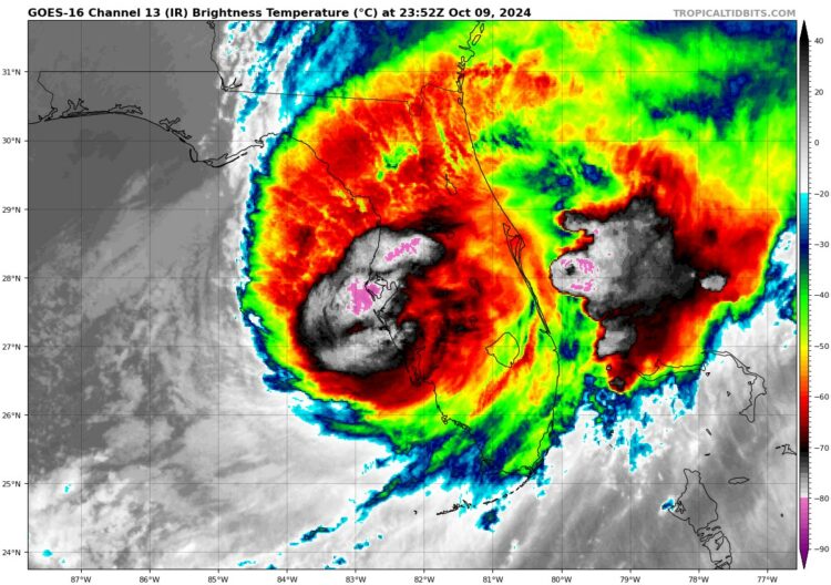
We can see the storm from above through satellite imagery. NOAA’s GOES system provides snapshots and animations at different bands around the world. The images update every five minutes, which is amazing.
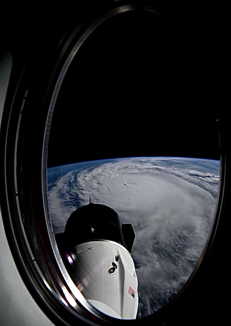
Even closer, Matthew Dominick, a NASA astronaut currently on the Dragon Endeavor, took a time-lapse as he passed over the storm:
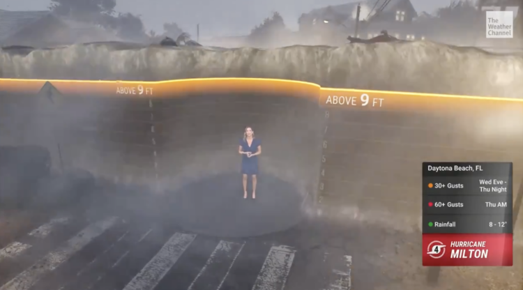
On the ground, the Weather Channel took the CGI route with a simulation of potential flooding. It’s a lot of water:
Just the data
While literal views bring us closer to reality, abstractions through data can provide a better feel for the patterns and help examine the details.
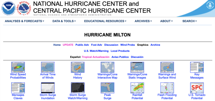
NOAA’s National Hurricane Center has many maps and datasets for the hurricane. They take a comprehensive approach, which is why so many news organizations use NOAA’s data as a main source.
The Wundermap from Wunderground is a tool-based view that shows you the data that you’re interested in. A menu lets you select what you want, which is not totally hurricane-related but especially relevant right now.
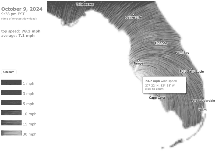
On the opposite end of the spectrum, Nullschool has a strong focus on wind:
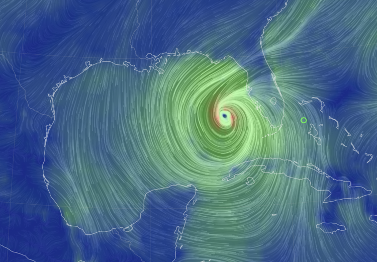
More lines swirl around Florida at the moment. Customize to see ocean currents, waves, temperature, precipitation, and more. The Nullschool Earth map is a descendant of the Wind Map, which shows wind patterns in the contiguous United States.
Curated views
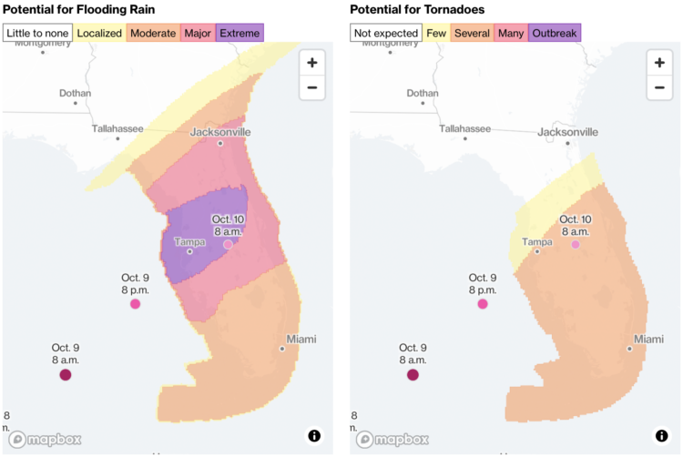
Then there is the coverage from news outlets. They take a more story-based approach where each map or graphic focuses on a certain aspect. Mostly, they highlight areas where residents should take extra precautions.
A decade ago, the graphics were more standalone, but now it seems more common to put everything into an updating stream — in line with the constant scrolling we’ve grown accustomed to. A single page ends up with a bunch of different views.
Bloomberg shows an estimated path, potential threats, a satellite view, storm surges, rainfall, and wind intensity all on the same page:
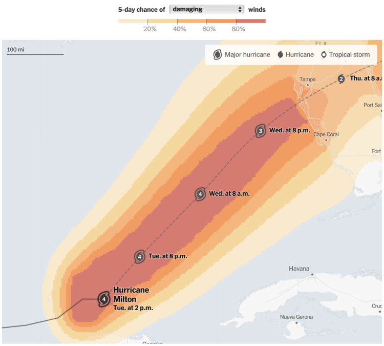
The New York Times takes a similar approach, framing a series of maps and interactive charts into question categories, such as “Where are evacuation orders in place?” and “When will damaging winds arrive?”
The Washington Post relies more on words and just a few maps to show what’s happening:
![]()
They all use “tracker” on the title page.
Less cone of uncertainty
While still found in some places, the cone of uncertainty is a lot less common. It’s a line that shows the estimated path of the eye of the hurricane and a single-color band that shows potential risk:
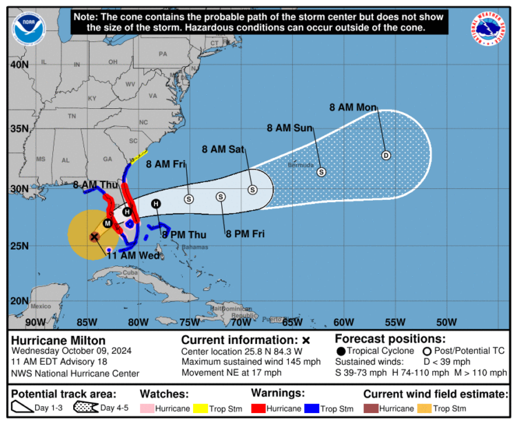
It stuck around for a while, but people began to note the challenges of reading such a map. So there are fewer cones and more avocados, which is a good thing.
Again, I’m writing this before Milton makes landfall. As of this writing, Milton is expected to be a Category 4 hurricane when it does. I’ll update this post version of this newsletter as more views comes in.
October 9, 2024 8:30 EDT — Milton makes landfall.
I think I’d keep my eye on the National Hurricane Center for the most up-to-date information.
October 9, 2024 10:09 EDT — Current Wind Map:
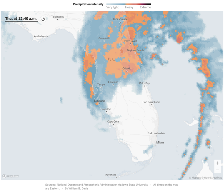
October 10, 2024 12:48 EDT — NYT has an animated map that shows precipitation intensity. It updates about every ten minutes. If anyone knows where to get this data, please let me know. The source says NOAA via Iowa State University, but I can’t track down the actual page or URL.
 Visualize This: The FlowingData Guide to Design, Visualization, and Statistics (2nd Edition)