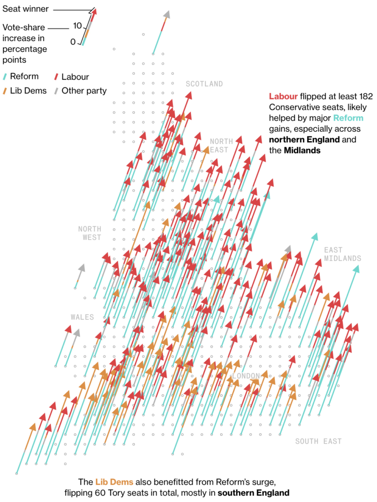
Speaking of Conservatives losing, Andre Tartar and Demetrios Pogkas for Bloomberg show the other end with party gains.
Angled arrows have become a staple to visualize net differences for regions on a map, but I think this is the first time I’ve seen the shaft of the arrow double as a stacked bar. Colors represent party gains. The head color represents the winner.
 Visualize This: The FlowingData Guide to Design, Visualization, and Statistics (2nd Edition)