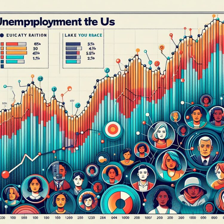
With each new AI-based tool that comes out, I begrudgingly kick the tires to see what kind of charts it spits out. I need to know when it’s time to hang the old data boots and switch careers. My most recent test subject: Microsoft Image Creator, which is powered by the text-to-image model DALL-E 3. These are “beautiful” charts through the lens of the model.


These are fine, I guess. Obviously they don’t show any real data yet. Maybe my queries need to be more specific, but these mostly feel like charts that were made to accommodate every data choice and angle instead of narrowing down to something useful.


