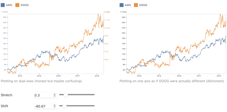
Charts that use two different scales on the same vertical often get the automatic “misleading” label, because if you stretch and shrink two data series enough, you’ll eventually find a way to make them look related. Toph Tucker argues that the automatic dismissal is misguided:
So yes, dual axes transform the series, and that transformation can lie. But it is the same kind of transformation that is already built into the Pearson correlation coefficient. Insofar as dual axes are bad, so is the Pearson correlation coefficient. Their merits and their badness go together. Dual axes are good at showing spurious correlation because they are good at showing correlation.
The challenge is that when you see a line chart with time on the horizontal axis and multiple data lines, it’s hard to separate coordinate systems and we’ve learned to read the lines as patterns over time. On the other hand, a scatterplot (or a connected one for time) highlights the relationship.
So while you don’t need to avoid dual axes completely, you should be careful when you do.


