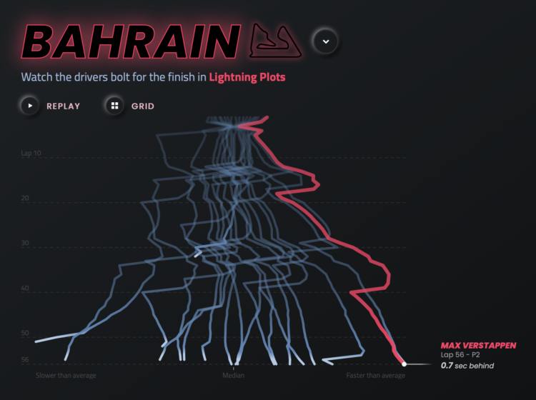
Joey Cherdarchuk used a lightning metaphor to visualize the outcomes of races from the 2021 season. The x-axis represents how far ahead or behind the each racer is compared to the average. The y-axis represents laps. Racing and thunder sounds play in the background for dramatic effect. I’m into it.
F1 Racing results plotted as lightning
Second Edition
 Visualize This: The FlowingData Guide to Design, Visualization, and Statistics (2nd Edition)
 Visualize This: The FlowingData Guide to Design, Visualization, and Statistics (2nd Edition)
New tools, refined process.