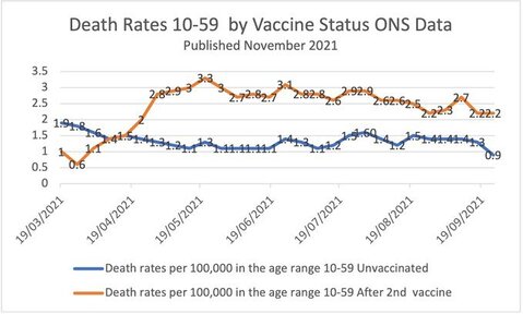
This chart, made by someone who is against vaccinations, shows a higher mortality rate for those who are vaccinated versus those who are not. Strange. It shows real data from the Office of National Statistics in the UK. As explained by Stuart McDonald, Simpson’s Paradox is at play:
[W]ithin the 10-59 age band, the average unvaccinated person is much younger than the average vaccinated person, and therefore has a lower death rate. Any benefit from the vaccines is swamped by the increase in all-cause mortality rates with age.
If you’re unfamiliar, Simpson’s Paradox is when a trend appears in separate groups but then disappears or reverses when you combine the groups. In this case, the confounding factors of age and vaccine uptake makes the above chart useless.


