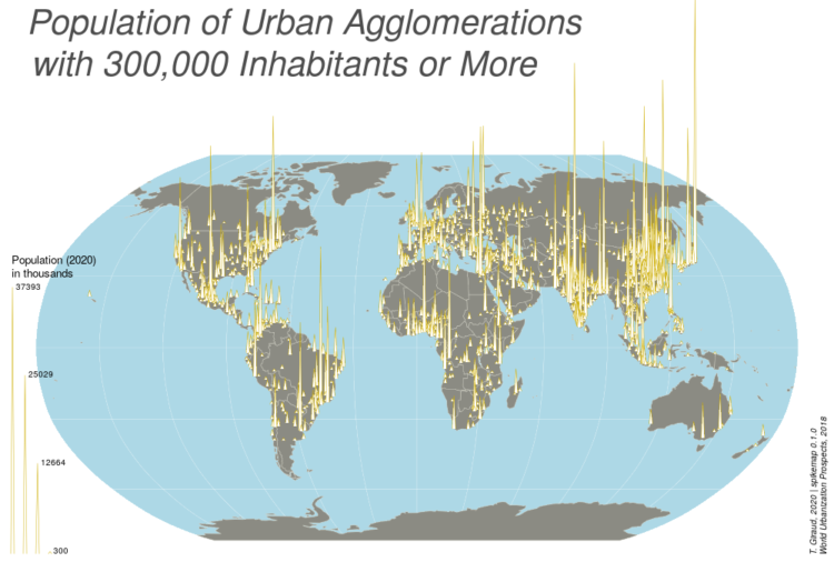
Spike maps use the height of spikes to encode data geographically. The format provides a similar effect to frequency trails where the layering looks 3-D-ish, except spikes are typically centered on an area instead of running parallel.
Anyways, like most visualization methods with a name, there is an R package for spike maps by Timothée Giraud.
If D3.js is your jam, there’s also a solution for that. You can also take the no-code route with Datawrapper.


