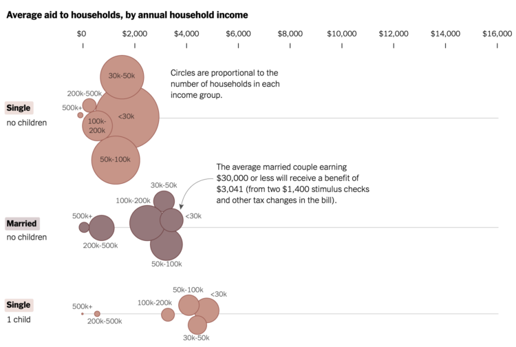
Alicia Parlapiano and Josh Katz, reporting for NYT’s The Upshot, plotted the average aid for different groups, outlined by the March 2021 stimulus bill. The estimates come from a new analysis by the Tax Policy Center, which contrasts sharply with the 2017 Tax Cuts and Jobs Act.
Check out the full Upshot chart, which shows single and married households up to three children or more. There are a few visual encodings going on here with the axes, bubble size, color, and income group labels.


