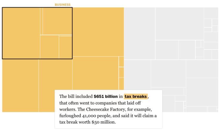
Using a straightforward treemap, The Washington Post looks at where the $4 trillion bailout went. As you scroll, different categories highlight with accompanying text.
This is probably the old man in me, and I know the scrollytelling format works better for mobile and provides more focus, but I find myself missing the large, featured-filled interactives. Those were the days.


