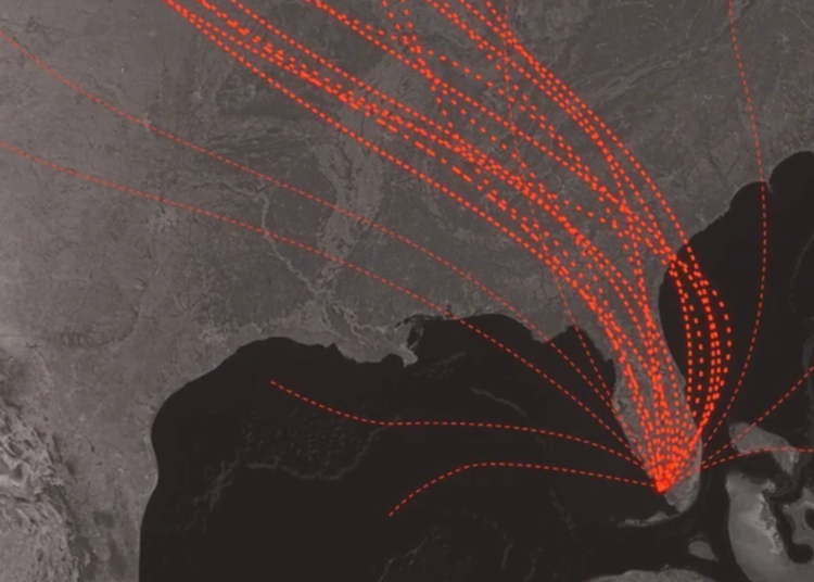
For The New York Times, Alberto Cairo and Tala Schlossberg explain the cone of uncertainty we often see in the news when a hurricane approaches. People often misinterpret the graphic:
The cone graphic is deceptively simple. That becomes a liability if people believe they’re out of harm’s way when they aren’t. As with many charts, it’s risky to assume we can interpret a hurricane map correctly with just a glance. Graphics like these need to be read closely and carefully. Only then can we grasp what they’re really saying.
Depict uncertainty more clearly, and people will understand the probabilities and confidence intervals more clearly.
 Visualize This: The FlowingData Guide to Design, Visualization, and Statistics (2nd Edition)