Animated maps of seasonal Earth

Jul 9, 2019

As you might expect, NASA collects a lot of data, and much of it is seasonal. Eleanor Lutz animated a few maps to show the detail:

To show a few examples, the NASA Earth Observations website includes data on seasonal fire incidence (1), vegetation (2), solar insolation, or the amount of sunlight (3), cloud fraction (4), ice sheet coverage (5), and processed satellite images (6). My own map (7) combines the ice sheet data and the Blue Marble satellite images (6). The NEO database also has many more interesting datasets not shown here, like rainfall, chlorophyll concentration, or Carbon Monoxide.

Check out the final result. And, if you want to make your own, Lutz published her code on GitHub.

Become a member. Support an independent site. Get extra visualization goodness.

See What You Get
Favorites

Top Brewery Road Trip, Routed Algorithmically

There are a lot of great craft breweries in the United States, but there is only so much time. This is the computed best way to get to the top rated breweries and how to maximize the beer tasting experience. Every journey begins with a single sip.

Peak Non-Creepy Dating Pool

Based on the “half-your-age-plus-seven” rule, the range of people you can date expands with age. Combine that with population counts and demographics, and you can find when your non-creepy dating pool peaks.

Life expectancy changes

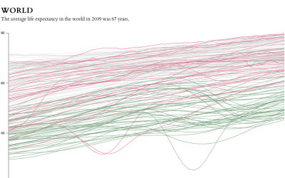
The data goes back to 1960 and up to the most current estimates for 2009. Each line represents a country.

Years You Have Left to Live, Probably

The individual data points of life are much less predictable than the average. Here’s a simulation that shows you how much time is left on the clock.