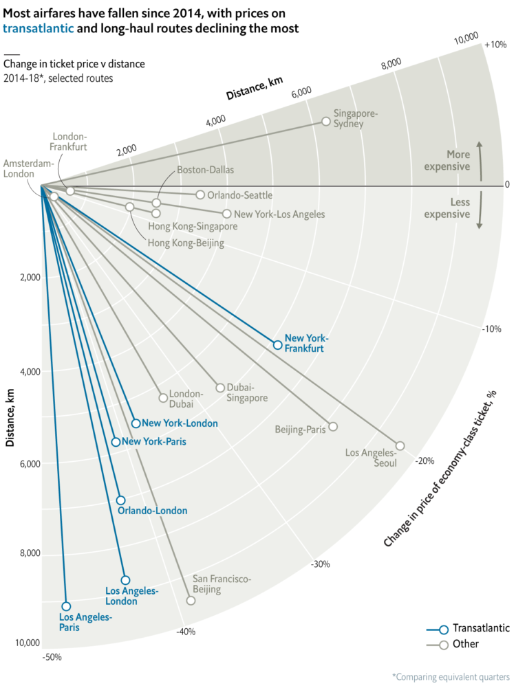
Based on data from Expedia, this is an interesting one from The Economist. Using polar coordinates, they used angle to represent percentage change in ticket prices and the radius to represent the distance of a flight.
Too bad they couldn’t get more data from Expedia. I would’ve liked to see the price changes for more flights, especially shorter ones to use as a point of comparison.


