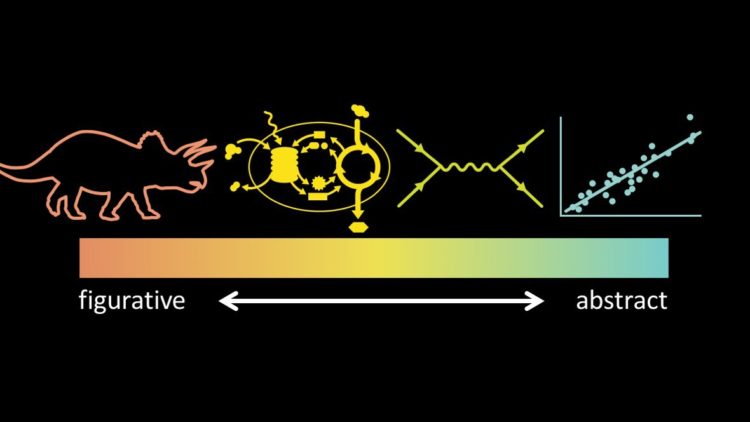
Jen Christiansen spoke about her extensive experience as a graphics editor for Scientific American. Her talk notes span a wide range of topics from the “rules”, the spectrum of visualization, and collaboration:
[S]ome of my favorite recent Scientific American graphics are the result of bringing together different artists—plucking experts from each of those groups and matching them up to create a final image that draws upon all of their strengths, not forcing one artist to excel in all areas. For example, I love to take an artist who can develop spot illustrations with a stylus or pen, and pair them up with an artist who can custom code data visualization solutions, as in this example by Moritz Stefaner and Jillian Walters.


