How to Make (and Animate) a Circular Time Series Plot in R
Also known as a polar plot, it is usually not the better option over a standard line chart, but in select cases the method can be useful to show cyclical patterns.
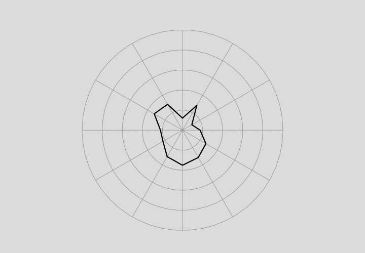
You’re probably familiar with the standard line chart to show time series data. The horizontal axis represents time and the vertical axis represents a metric. This plot type uses a Cartesian coordinate system. The circular time series chart uses a polar coordinate system. Angle represents time, and distance from the center represents a metric.
In most — almost all — cases, the standard, Cartesian method is the better way to go. It’s easier to read, it’s easier to make comparisons over time, and because they’re more common, more people know how to read them.
One case where the circular version might be visually helpful is when the data is cyclical or seasonal, and you want to focus on that. Maybe you want to match up all the January data points, all the February ones, etc.
To access this full tutorial, you must be a member. (If you are already a member, log in here.)
Get instant access to this tutorial and hundreds more, plus courses, guides, and additional resources.
Membership
You will get unlimited access to step-by-step visualization courses and tutorials for insight and presentation — all while supporting an independent site. Files and data are included so that you can more easily apply what you learn in your own work.
Learn to make great charts that are beautiful and useful.
Members also receive a weekly newsletter, The Process. Keep up-to-date on visualization tools, the rules, and the guidelines and how they all work together in practice.
See samples of everything you gain access to:

