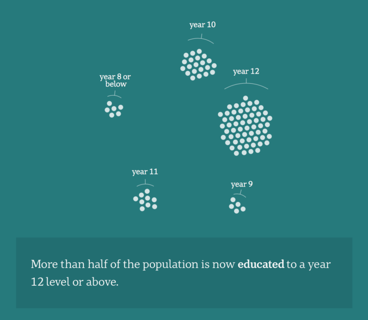
Opting for the force-directed clusters route, Catherine Hanrahan and Simon Elvery for ABC News visualized Australian demographics at the scale of 100 people. Each dot is a person, and as you scroll, you get different breakdowns. It’s percentages, but treating each percentage point as a person makes it more relatable.
See also: Demographics in a world of 100.


