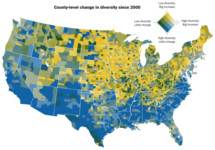
Dan Keating and Laris Karklis for The Washington Post map the change in diversity since 2000. The color scale, shown in the top right, represents two things: level of diversity and change in diversity. I’m not so sure the dual scale is interesting as a whole, as my brain just wants to split out each category individually or see each one separately. But keep scrolling and you can get that separation, which is a lot more visually helpful.
See also: percentage of white people, majority minorities, and predominant race.


