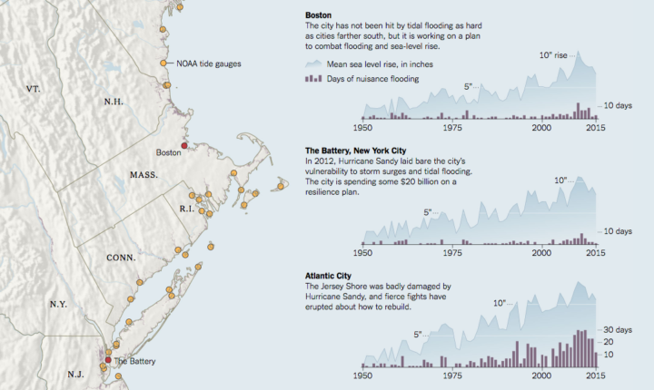
Water levels are rising, and naturally, the coasts are feeling it. Jonathan Corum for the New York Times shows the rise in tidal flooding along the Atlantic and Gulf Coasts. Scientists think it’s going to get a lot worse fast.
The time series charts are an interesting use of dual axes. The background is mean sea level rise, and the bars are days of flooding. Most of the time, mixed units don’t work so well, but I think it works here, with labeling and varying color gradient to differentiate the two chart types placed one on top of the other.


