Last year I put together a four-week course to provide FlowingData members with guided instruction through a few year’s worth of a la carte visualization tutorials in R. While some people have specific visualization types in mind, you might want to learn more about the overall process.
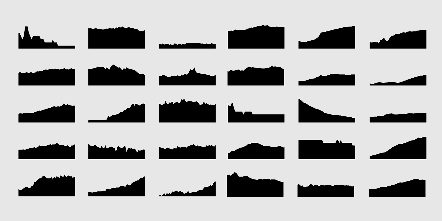
In the same effort, but a bit more focused, here is a crash course for visualizing time series data in R. It’s meant to be digested over just a couple of days to get you going with your own data right away.
All members can access it now.
If you’re not a member yet, you can sign up here for instant access. I’d love your support.
The crash course is for people relatively new to visualization in R, and you don’t need programming experience to put it to use. You start with the basics, move into more advance visualization, and then work through common stumbling blocks to avoid getting stuck.


