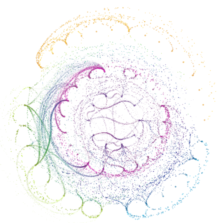
If you think of network visualization as a collection of nodes and edges, you typically get a bunch of circles and lines that vary in width to represent volume or strength of connection. However, in this visualization, Fathom used dots to represent patients moving between different states of a health network. The more dots the more patients, or in terms of networks, the stronger the connections.
I don’t find the topic all that interesting, but the implementation is pretty sweet.


