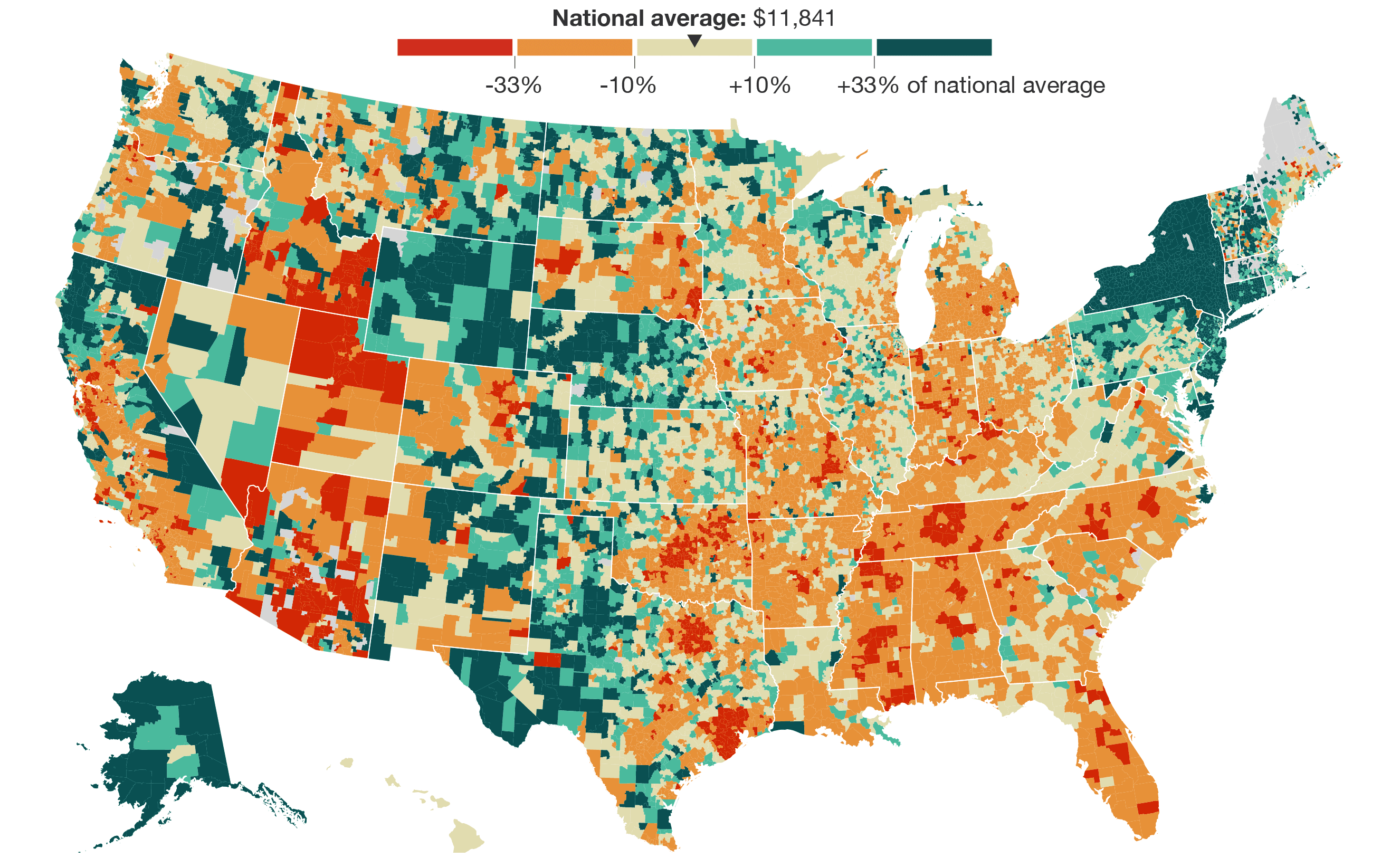
NPR is running a series on spending and school districts and all its complexities with government funding and whether or not more money even helps. They start with a map that shows the differences in spending per student in primary and unified school districts. Dollars are “adjusted for regional differences in cost of living, using the NCES Comparable Wage Index 2013.”
As you scroll down the story, an interactive map pans to the geographic area you’re most likely located in. It’s a small thing that we’ve been seeing more of lately. Since users are most likely to zoom in to their own area to compare, might as well try to do it for them. I like it.


 Visualize This: The FlowingData Guide to Design, Visualization, and Statistics (2nd Edition)
