As we use up current energy resources, it grows more important to look to alternative energy sources. Wind is one potential area, but the problem is that one has to know where it’s windy enough — now and in the future — to justify the cost of building the structures to harness the energy. It’s freakin’ wind, and variability is all over the place.
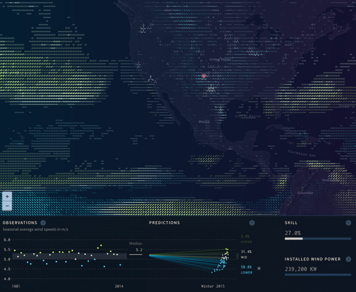
Project Ukko is an effort to make wind research predictions accessible to those who need such information. The visualization component by Moritz Stefaner, in collaboration with Future Everything and BSC, shows a number of wind factors around the world.
Lines on the map represent three things at once. Opacity shows the strength of prediction based on historical data, width represents wind speed, and angle plus color represents predicated change in wind speed. Select any line for more information on a specific area, which includes a range of possible outcomes instead of just a worthless mean or median.
Really nice, and I imagine it should be quite useful for those in the wind industry. For the rest of us, it’s fun to look and poke at.
Summary of the project in the video below:
Also, find out more on Moritz’s design process on his site. [Thanks, Moritz]


