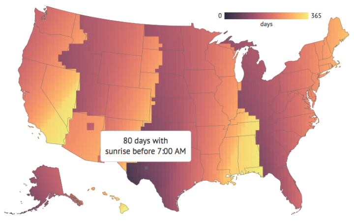
Keith Collins for Quartz made an interactive that showed how much more daylight you get because of Daylight Saving Time. But it was generalized to a single location. Andy Woodruff is on it, and added a geographic component.
It’s noted on that page that the chart’s data “assume you are located in New York, but differences are minimal across the contiguous 48 states,” but I’m a geographer and must always disagree with any and all spatial claims, by anyone. I live in the same time zone where I grew up, but the sunrise/set times are almost an hour different between the two places.


