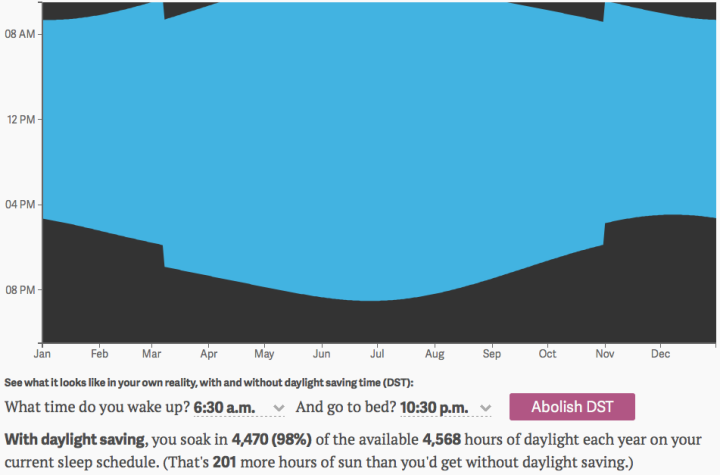
We recently fell back an hour with the end of this year’s Daylight Saving Time, and as per usual, we had to discuss why or why not we should shift out clocks at all. But the main question is — what it all really comes down to — what have you done for me lately, Daylight Saving Time? Keith Collins for Quartz put together an interactive that shows you an answer, based on the waking and sleeping times.
The blue area shows the daylight you experience, and the black represents the dark you get. Some quick math on the bottom of the chart shows how many more hours of daylight you get, thanks (or no thanks) to Daylight Saving. [Thanks, Steve]


