Bar Chart Baselines Start at Zero

There are visualization rules and there are visualization suggestions. Most are suggestions. The ones that are rules exist because of how our brains process visual information. There’s just no getting around it.
I already covered the small handful of rules that pertain mostly to traditional statistical graphics. The first one—to always start your bar charts with a zero baseline—unexpectedly drew some disagreement, and I am unexpectedly compelled to go into more depth.
It’s true that every rule has its exception. It’s just that with this particular rule, I haven’t seen a worthwhile reason to bend it yet.
Example
I have weight data that goes back to my second year in graduate school up to the present. I don’t log weight at regular time intervals, but for the sake of simplicity, let’s pretend that the measurements are daily.
This is what a standard bar chart looks like with a zero baseline.
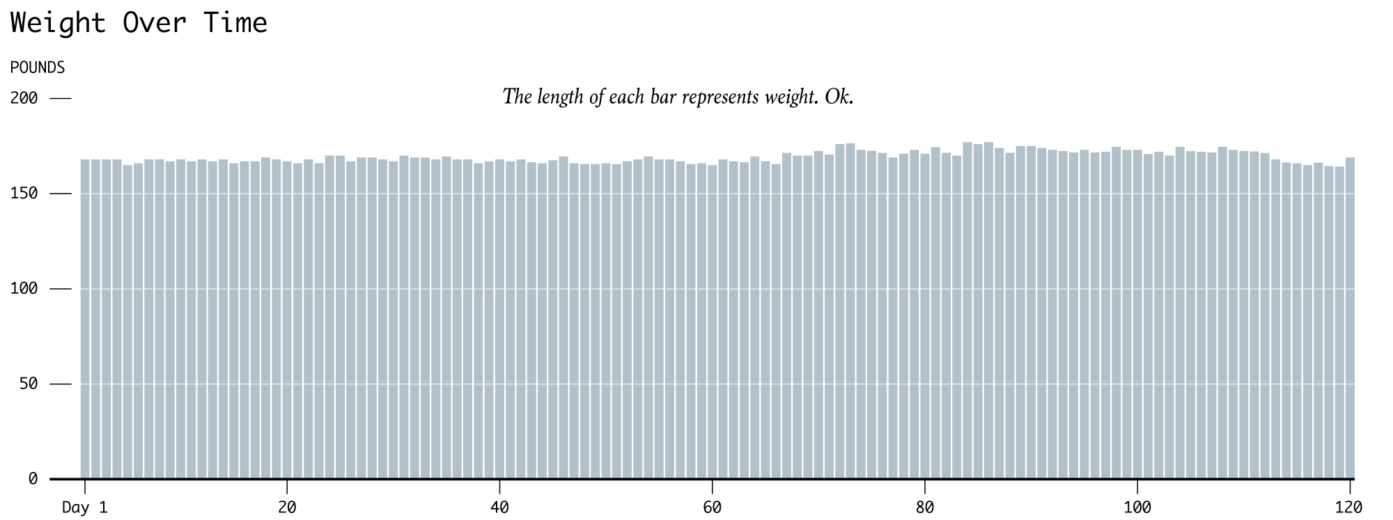
The bar length encodes the value. Readers look at bar length, and their brains are like okay, I’ll decode that now for you. Beep beep, boop boop.
It’s not exciting. I know. But you can see some fluctuation. There’s an increase around day 70, it stays that way, and then there’s a decrease towards the end. In real life, the increase came when I moved from Los Angeles, California to Buffalo, New York, because my wife had to go to the latter for work. This was also around the time we got married.
Anyways, the changes don’t look dramatic. As many of us know, weight gain creeps up on you slowly, but that’s aside the point. Some argue that to make the differences more obvious, you truncate the value axis, bringing the zero baseline up to a more reasonable value. You would be hard pressed to find a male adult who weighed zero pounds, so why include that in the range of the chart at all?
Below is the same data with a baseline of 120 pounds. In a quick search, I stumbled on a weight study from the National Institutes of Health, and none of the adult men in the sample weighed under 120 pounds. So yeah.
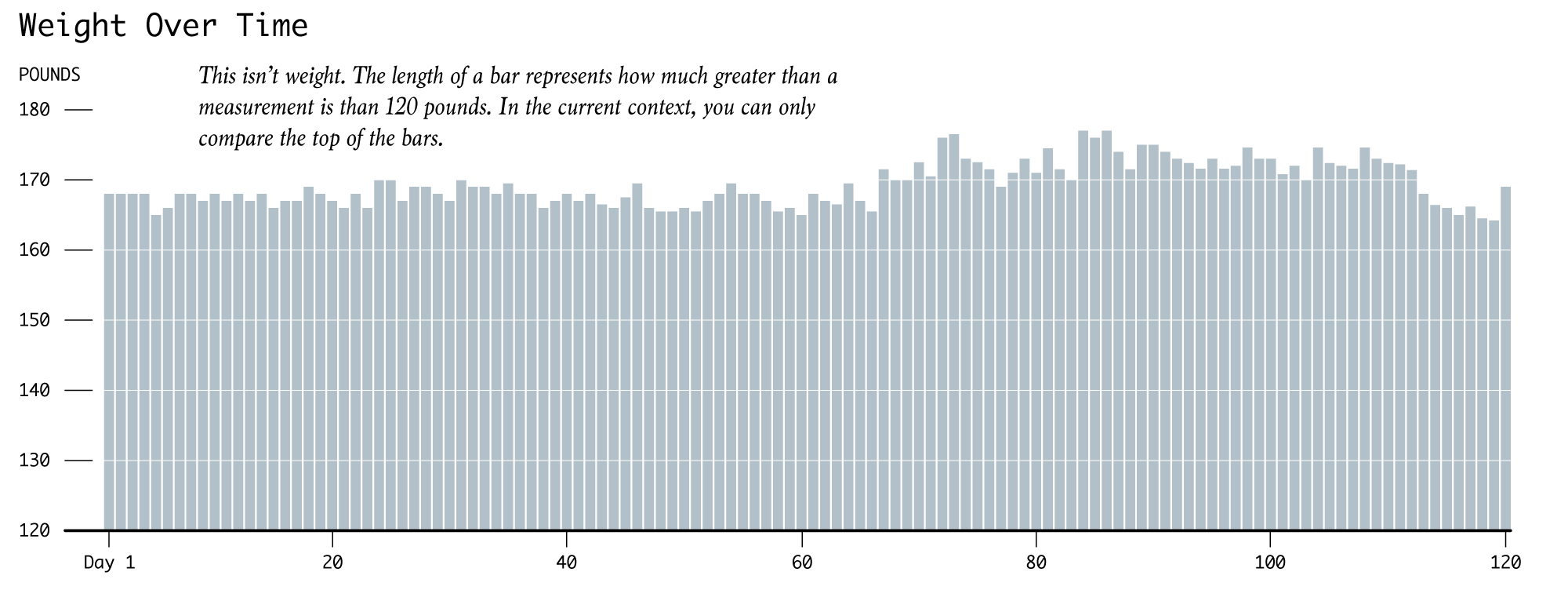
Differences are definitely more obvious, but in this context—weight over time—there’s a conflict between bar height and the measurements. Bar length now represents pounds greater than 120. That’s what the title should read, and the range of the value axis shifts down to 0 through 60.
I am totally aware of how nitpicky this sounds, but setting the context of your data matters a lot. Just imagine this was actually important data instead of some guy’s weight over the years.
Moving on. The chart above makes changes more obvious. Sure. I guess. We can make them more obvious though by changing the range of the value axis to match the range of the data. In this case, that’s 164 pounds to about 180.
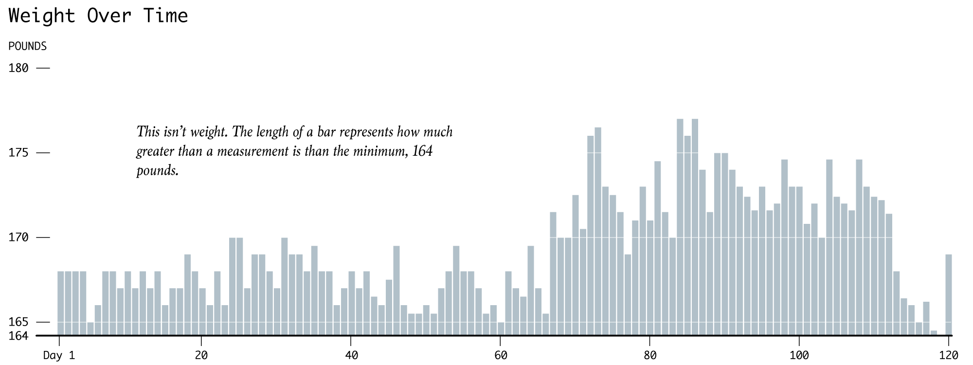
This carries the same problem as before. It’s not weight over time. Bar length represents the number of pounds greater a measurement was than my lowest weight over the time span.
There’s that conflict between visual encoding and context again. The bar length says one thing, and everything else around it says another. Your brain is all like, “What the what?”
How do we get everything in sync?
Here’s one option that shifts context to the actual weight differences and away from weights over time.
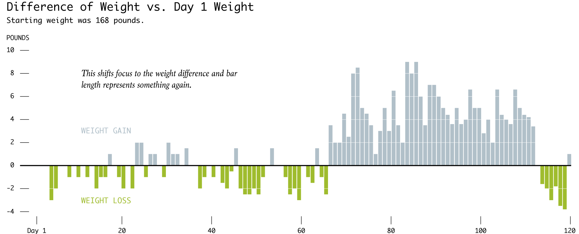
The difference chart doesn’t force the reader to do the math in his or her head, regardless of how simple it might be. The chart doesn’t assume that the reader can and will figure out the full context of the data. Readers carry their own assumptions, especially with traditional visualization types like the bar chart, so no need to throw more on to the pile.
In this example, we could just throw out the bar chart completely and use a line chart instead.
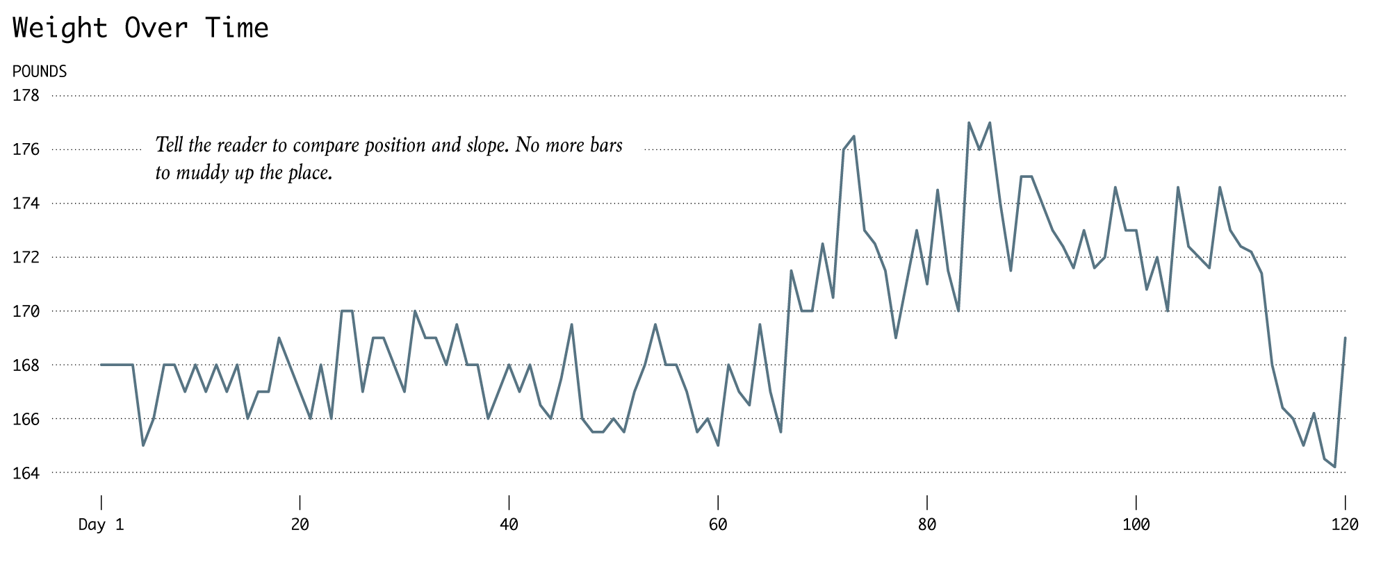
But. But. The value axis doesn’t start at zero. What gives? The line chart doesn’t need a zero baseline, because bar length is out of the picture. There’s no more conflict between visual encoding and context.
Suggestions exist for minimum and maximum slope in line charts, but we won’t get into that now.
Instead I end here with one more simple example.
The main argument for bar charts without a zero baseline is this: There’s no point in extending the range of the value axis if the range of the data never includes zero. Ok.
Now instead of weight, let’s look at height. I think we can agree that it’s difficult to find people who are zero inches tall. I’m 70 inches tall, and my son is half my height at 35 inches. The bar chart on the left shows the comparison with a zero baseline, and as expected, the bar for me is twice the length of the bar for my son. On the right, I take it to the extreme and set the baseline to 35 inches, and the bar for my son disappears.
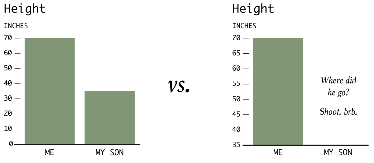
Maybe the latter communicates that I’m much taller, but the magnitude is infinitely exaggerated.
Wrapping up
I can’t believe I wrote that much about a zero baseline for bar charts, but that’s my stance on the topic. Like I said, for visualization, there are rules and there are suggestions. This zero baseline thing is a rule. Conflicts between context and encodings must be avoided.
In summary, as my sixth grade teacher used to say, “There are three rules you should always follow in life. Never arm-wrestle Superman. Don’t pee into the wind. And pay attention when I teach.”
Feel free to ignore that last one, but give your bar charts a zero baseline (and try to follow this small rule set too). If it doesn’t seem to work, switch up the context or try a different visualization method.
Become a member. Support an independent site. Get extra visualization goodness.
See What You Get

