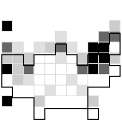
There’s been a sudden bump in grid maps lately taking the place of state choropleths. For example, Haeyoun Park used them to show changes in state laws for gay marriage. The advantage over the choropleth is that each state gets equal visual space, and the placement still lets people find specific states and interpret geographic relationships.
The grid format is pretty much universally liked, but now we must ask what shape is best? NPR tried the grid with hexagons. Danny DeBelius explains the reasoning, and the grid map landscape may never be the same again.
But you know what? Forget all that.
All that matters right now is the wild experimentation of a brave few who dare to do the impossible and strive to make dreams a reality. It is the work of those who ask, “Why use traditional geometric shapes?” that drive us forward.
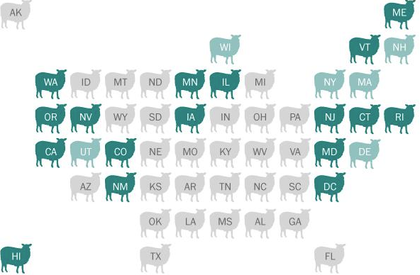
From Katie Park, who dared to use sheep:
Or Matt Nelson, who took the cart-ogram to a new level:
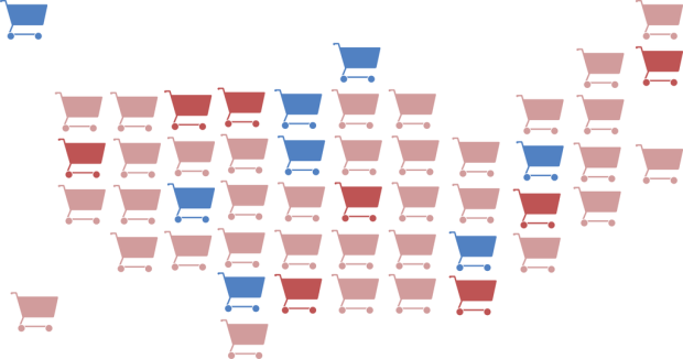
Cart icon from the NounProject by Iconic
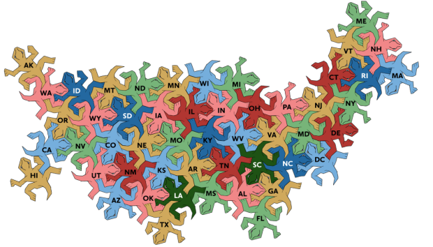
Interlocking lizards from Evan Henſleigh:
Oh yes.
This is what I woke up to on Twitter this morning, and it was just what I needed. Keep dreaming.

