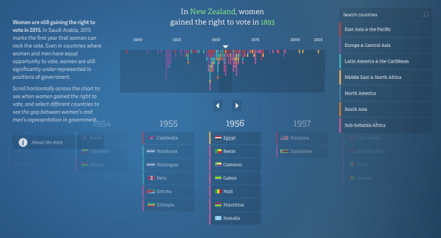
In their continued work on the No Ceilings project, Fathom describes the current iteration of the site that shows 20 years of data, across hundreds of indicators.
We identified more than twenty data-driven narratives that could be explored or illustrated visually. While some stories contained ample information to work as full interactive pieces, other stories were better served as headlines with simpler graphics. In addition, users can see the entire data set mapped by country from 1995 to the present, across 850,000 data points.
Explore individual indicators through topical graphics, or browse all the data via the global map. You can also download the data as a bunch of CSV files.


