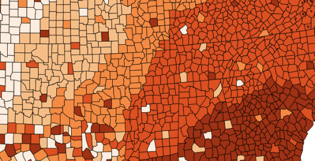
Wired wrote a short profile for Cynthia Brewer, best known for Color Brewer, a tool that provides visually apt color schemes for maps (and charts).
Brewer has been thinking about these issues since her graduate days at Michigan State. But the idea for Color Brewer grew out of a sabbatical she did with the U.S. Census Bureau, overseeing the atlas that accompanied the 2000 Census. “We were trying to be really systematic with color throughout the atlas,” she said. Other mapmakers liked the color sets they developed and began asking for them, and Brewer set up Color Brewer to make them more readily available.
If you’ve looked at thematic maps at all, you’ve likely come across a color scheme from Color Brewer. I wouldn’t say it’s ubiquitous quite yet, but it’s close. I just like how something so widespread came from a couple of people in a room who wanted to streamline the process of putting together the decennial atlas.


