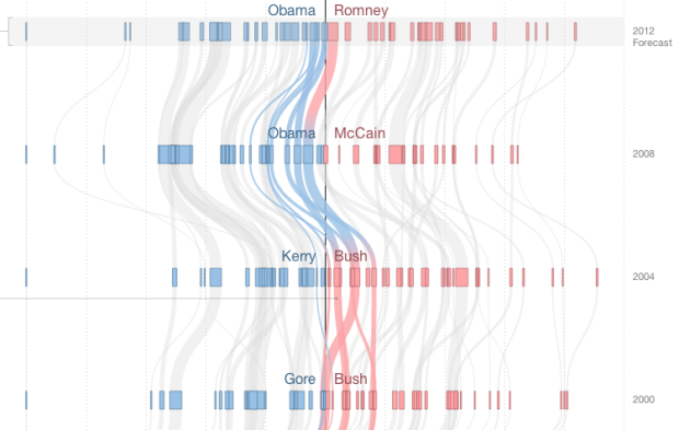
Mike Bostock and Shan Carter visualized how states have shifted parties over the years, going back to 1952.
Recent elections have placed a heavy emphasis on “swing states” — Ohio, Florida, and a handful of other states most-easily swayed from one party to the other. Yet in the past, many more states shifted between the Democratic and Republican parties. A look at how the states stack up in the current FiveThirtyEight forecast and how they have shifted over past elections.
Each row represents an election, and the horizontal axis reflects the size of a lead for a party. So as you scroll down, you can see how much (or little) a state has changed across elections.
Instead of taking the obvious exploratory route, where you select your state and scroll to the bottom, Bostock and Carter took a story-driven approach. Points of interest are on the left. Click on a button and the relevant states for that insight are highlighted. (Although you can still mouse over states to see their paths and keep states highlighted by with a continuous scroll.) This is a good one worth exploring for a while.
See also Adrien Friggeri’s interactive from earlier this year that shows Senate agreement.


Man, those guys are good. This is excellent.
In fact maybe the only non-minor-aesthetics thing I’d change (other than using Raphael for IE support) is the wording of the heading “As Goes Ohio”. It works after you’ve read the paragraph below it, but before you’ve read that paragraph, it sounds like it follows on from some previous text (“[State] goes from [party] to [party]… as goes Ohio”). Since it doesn’t follow on from the paragraph above it, you can get the misleading impression that the reading order is bottom-to-top and that you’re reading wrong if going top-to-bottom. Clear, unambiguously signposted reading order is really important for communications-oriented graphics.
I like the idea, but I don’t like the execution. I find that I’m scrolling up and down too much, and I want to be able to follow a state to see it change over time, but it won’t even lock onto a state. I’d really like to explore it, but they make it really hard to do it.
Good observation – the behaviour on clicking on a state seems surprisingly inconsistent. You’d expect clicking to lock a state as being highlighted, with some visual cue like a deeper drop-shadow / outline and the others becoming slightly more faded still – then any click on or off that state unlocks and reverts to normal. Instead, clicking a state makes it flicker, and nothing else. Sometimes it seems to make it stay highlighted for a few seconds, but I might be imagining that. Strange decision. (also just noticed it seems way way slower in Firefox than Chrome, but I guess that’s not unusual)
Actually seems like clicks are designed to cycle through when multiple states are on top of each other. Seems like not the most intuitive way of doing this – when something is hover-highlighted, you expect a click to interact with it, not the now-invisible thing below it.
A better system would be: clicks set ‘locked’ state signified by a stronger outline. When ‘locked’, the next one underneath in the stack is the one that is highlighted on mouseover – and becomes the new ‘locked’ when clicked on. All others also highlight on mouseover and become the new locked one when clicked as before. Any click on the canvas clears whatever is locked.