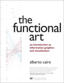
 Alberto Cairo’s newly translated book on information graphics, The Functional Art, is a healthy mix of theory and how it applies in practice, and much of it comes from Cairo’s own experiences designing graphics for major news publications. (I don’t think Alberto remembers, but what seems like many years ago, I sat right behind him for two weeks at the New York Times when they brought him in to help illustrate Raphael Nadal’s approach to tennis.)
His experience is hugely important in making the book work. There’s a growing number of books on information graphics, and many are written and illustrated by people who don’t have much experience displaying information, which leads to art books posing as something else. This isn’t one of those books. Cairo knows what he’s talking about.
As you flip through, you’ll notice a lot of examples, with a focus on process and even a handful of pencil sketches. The last third of the book is interviews with those well-established in the field, which also walks you through how some graphics were made. There’s a strong undertone of finding the balance between function (e.g. efficiency and accuracy) and engagement (e.g. use of circles).
Cairo comes from a journalism background, so the book is mostly in the context of presentation, but there’s of course plenty that you can apply to more exploratory graphics. I would say though that Cairo’s strength is in illustration and information, and so the book reflects that. This isn’t a book that covers visual data analysis or statistical concepts, but it is one that explores and describes the making of high quality information graphics that lend clarity to concepts and ideas. If you’re looking for the latter, The Functional Art is worth your time.
Check out the sample chapter on the publisher page, but then grab it on Amazon and save a few bucks.


I attempted to plough through the Spanish version a few months ago (not as hard as I expected since so much of the vocab was/were(?) latin-origin academic terms that are almost the same as the English). I found it good, but a lot of his examples seemed to be a bit straw man – attacking weak obvious targets and illustrating good practices using cases that weren’t as complex or challenging as they seemed. Definitely worth a read though.
I don’t suppose you or anyone else know how different the English version is to the Spanish version El Arte Funcional?
In an odd clash of internet and real life – Alberto was one of my professors in college. The man knows his infographics. Interesting that his name would pop up when I’m in the midst of a career redirection.
There’s gotta be some hidden message in there.