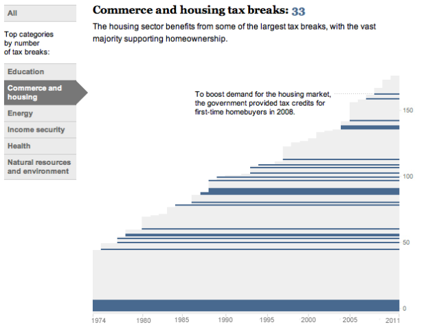
Kat Downs, Laura Stanton and Karen Yourish of The Washington Post look at the tax breaks from the 1970s to 2011 in an interactive.
The U.S. government gives away more than $1 trillion a year in tax breaks — subsidies for individuals and companies that are often substitutes for direct government spending.
Once written into the tax code, they tend to stick around.
Each stripe represents a tax break, and height represents the value of the break in 2011. Interaction is key here, which lets you select categories such as education and health and mouse over breaks for more information. The chart above is also linked with a time series, which provides an alternative view to the same data.
 Visualize This: The FlowingData Guide to Design, Visualization, and Statistics (2nd Edition)
I’d be curious to see a version of this with all tax-breaks – not just those on the books today (so they’d come and go over time). A more complicated picture to be sure, but also more historically relevant, since I’m not sure the height of the chart in 1974 is really that meaningful (given there were presumably tax breaks that existed then, that don’t now). But, from a “now (2011)” perspective, this is interesting.
I’m also confused by that bar chart in the bottom right – what are the axis?