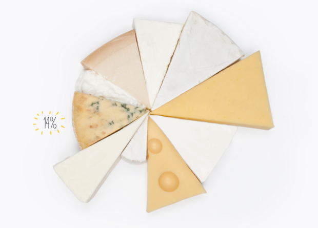
You would think that fat content and calorie counts would be straightforward by now, but serving size mucks it all up. It’s like, “Great, this ice cream is only 200 calories!” Then you come to the sad conclusion that you just ate a bowl worth half a million calories, because the serving size is that of a rice grain. Fat or Fiction tries to clarify some of these fat counts, for items like cheese and cake, by placing food servings next to each other.
Some of the labeling is confusing, because it’s off to the left and in small print. For example, the 14 percent above is the percentage of fat in that wedge of blue stilton cheese against the rest of the wheel. Each wedge is 100 grams of cheese, so you get a sense of fat and calorie density.
But hey, I’m a sucker for anything food-related and these pictures are making me hungry. That’s the goal of the site, right?


I was all for this, until I saw they had cut battenburg into a wedge. That’s just wrong :)
I was a bit confused by the percentages and the fact that the cake + cheese isn’t supposed to be a pie chart of those percentages, at least not by shape/area. Yummy though!!
These are not accurate. The cider graphic shows zero carbs and zero sugar. They should’ve focused on facts instead of being pretty.
The candy chart is totally confusing. I kept thinking there was some kind of horizontal axis that I was missing.
not a fan of this — looks like it’s just trying to be eye candy
They have a great idea but a flawed execution. A far more informative approach would be to choose a arbitrary amount of calieries (e.g. 200) and show the diffrent amounts of food that would equal that amount. Something akin to the “Junk food equivalents of sugary drinks”.