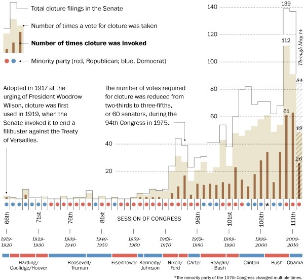
Washington Post’s Ezra Klein busts on the filibuster. Gone are the days of Mr. Smith when invoking the filibuster was seen to serve a greater purpose. The filibuster has its roots in Ancient Rome, and apparently even then it had its critics.
This chart is a great example of providing a lot of information in a concise area. All of these data points are relevant to the topic and helps us inform our opinion about the matter.
[via @hfairfield]


I like the way they did the vertical axis to give space for explanation in a way that also delineates major grouping or “step changes” and brings the axis labels closer to the relevant data. I may have to steal that idea some time.
So for international readers and those of us who aren’t American politics buffs: a filibuster is arbitrarily blocking a bill or act of government (traditionally by one person talking for ages until it runs out of time), and a “cloture” is a vote to prevent a filibuster? And since 1975 this has required a two-thirds vote (a ‘super-majority’)?
So effectively, any opposition congressman can veto a bill unless two thirds of the house will vote to protect it?
Is that right?
Anyone?
I’m sorry, but this isn’t a very good chart at all. If anything, it’s a great example of why dumping tons of information into a small space often has an inverse affect on its message. Of what relevance are the session numbers, the senate majority party, and the presidency? I see no discernible pattern on cloture with the inclusion of this information that would not have already existed in its absence. Most importantly, of what relevance is this chart to the question posed in the header?
We shouldn’t just like things because they look pretty and confirm our beliefs.
Actually, this didn’t confirm my beliefs at all. And my first question was to figure out if it was a party issue. I presumed a minority party in congress with the opposing party in the presidency was going to show a correlation. But of course, when I checked that, it didn’t seem to matter at all. So perhaps they are providing that data specifically to disprove that it’s because of warring parties. I could do without the “session of congress” bit, but other than that, the information all seems highly useful.
I see your point about political parties, but the Democrats of the 1960s (and earlier) are ideologically different than modern Democrats, which makes such timeseries comparisons questionable. Moreover, even if there did appear to be a pattern concerning political minority and cloture, without more information, could we really conclude anything by the correlation except that it exists?
To me, the prevailing data show trend as the most important point in this chart. So information like specific data labels, party positions, information about the year of adoption, etc. don’t really add anything (except ink). Compare the chart above to this one form wikipedia, http://en.wikipedia.org/wiki/File:Cloture_Voting,_United_States_Senate,_1947_to_2008.svg. I’ll leave it to the readers to decide which is better.
I’m with Jordan — the chart is overly complicated. The one he linked two may not be as refined, but it presents the information much more concisely.
Why do people hate null results? A null result is a result.
If there’s no correlation when people might expect that there might be, that’s an interesting piece of information.
That’s why this chart, while slightly more challenging, is more interesting than the wikipedia one below. It shows some context and shows how this fits in with that – and the answer, it turns out, is not as neatly as you might expect. That’s relevant information.
There are lots of things that could be done to tidy it up visually, but adding relevant context is useful – including when it shows you that something isn’t as relevant as you might think.
My point is that the data isn’t just superfluous, it’s distracting. Consider your response. Does the absence of correlation imply no causal relationship exists between minority party and cloture, as you suggest? Emphatically, NO: it does not and cannot. In fact, that’s called an “inverse error,” and it’s being employed on top of a correlation-causation fallacy. Look, putting extra information on a chart absent some affirmative argument concerning inclusion is making a half-argument and asking the audience to fill in the holes. Don’t get me wrong, I’m not suggesting that you shouldn’t have an open mind or that you shouldn’t draw your own conclusions independent of other opinions. Far from it. Rather, my point is that the inclusion of “contextual” information without any real connection or dependence to the overarching trend can unfortunately lead us to conclude what cannot be concluded. In other words: we should expect visualizations, like essays, to make arguments in the affirmative. Information should not float around aimlessly to be read like tea leaves.