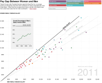
 A couple weeks ago, I looked at gender pay gap data to see how the differences have changed over the past nine years. This was after seeing Narrow the Gapp by Gina Trapani and then a Time Magazine cover story on how more women are becoming the main earners of households. A little after that, Mike Bostock posted his D3 port of GapMinder’s well-known Wealth & Health of Nations, and the New York Times interactive by Hannah Fairfield and Graham Roberts from 2010 came to mind. My idea was to combine the two as a recreation of the latter, with a couple of my own interactions. I went to work on a bunch of horrible government PDFs and then pulled it all together.
(I was mostly interested in what the data looked like. I was hoping to see a counterclockwise turn towards the equal pay gap line, but of course, it’s never that simple.)
At some time late at night, I put up the graphic and hastily posted about it. I wrote in the footer of the graphic that it was an update to the NYT version that made use of Mike’s D3 and left it at that. And that was fine. There were some good comments, and I was happy that Graham and Hannah shared it on Twitter.
But then there was confusion when my graphic went up on CNNMoney a few days later without a nod to NYT. That’s when I got my first taste of online bitter. It tastes bad, and it’s kind of scary how quick people are to think the worst.
However, it was an honest mistake by both CNNMoney and me. They didn’t catch the note in the footer, so they didn’t realize I had recreated the NYT graphic. They were quick to act when they found out though, so good on them.
As for me, I live in a bubble where I share whatever I want on FlowingData and all the mini-projects I work on simply come out of my own curiosities. I didn’t even think about possible conflicts when I was asked if it was okay to share the graphic. We did something similar with the Walmart map a while back, and the contrast between comments from CNN’s general audience and FlowingData’s was fun to see. So I just said sure. I should have thought a little harder.
Anyways, I’ve learned my lesson. I’ll make recreations more clear — if I do them at all at this point — and no more hasty posts late at night.


Don’t worry, haters are everywhere. Just keep on the great job ! Thanks for what you’re doing here :)
I felt really bad as I watched that play out – I for one have gotten a lot out of your recreations, and as a fan of your tutorials, I was really hoping to see this one make it into the tuts. For those of us who aren’t making stuff as good as the NYT’s, seeing the steps one would go through to do them, even if in another tools, is incredibly useful. It’s like writing exercises for infovis – “now do a heist in the style of Faulkner” or something.
Props, Nathan!
Hey Nathan, thanks for sharing the story so that we can all learn a little from it. You do beautiful work and I hope this experience doesn’t stop you from doing (and sharing) certain kinds of it. In particular, redesigns can be really valuable. It’s helpful to see how various designers make different choices about how to represent the same data set. This was just a minor transparency fail, which has been quickly rectified. Keep up the great job.
My gut tells me that you should charge ahead, continue to follow your curiosity and passions! Your blog is your personal reflections on matters that you consider important…even late at night. Obviously you should clearly cite your sources, which you do. Others who extract from your blog assume the responsibility to interpret your material professionally.
Did the transaction with CNN Money involved any payment to you? And did you make the NYT aware that your creation using their design will be published on a competitor website?
Thanks for clarifying!