The Iliad is an epic poem by Homer with a lot of characters and story lines going on at once. I vaguely remember reading bits and pieces in high school and getting totally lost. Santiago Ortiz explores these relationships in his latest work, which draws on the connections i.e. character sentence co-occurrences.
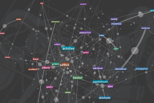
There are two views. One is a network diagram (above), with characters sized according to number of connections with others, and a matrix view accompanies. The network has sort of a fisheye effect as you mouse over, which I think is there to make it easier to browse, but as it goes with these sort of visualizations, there are still some challenges as you try to get more details or look at smaller nodes.
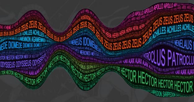
The second view is a streamgraph, with a stream for each character.

I had trouble getting excited about the content, but it’s fun to play around with the interactions.


I think this is a neat idea for helping learn about the book – but it doesn’t leap off the page that Meneleus is married to Helen, or that Hector and Paris are Priam’s sons.
Maybe a genetic map, a familial map, a fight map, a coalition map… overlaid, and then flowed through time…
Now if only someone would do this for One Hundred Years of Solitude!
I totally agree!!!!!
For character relationship and narrative visualizations, I still like the xkdc model: http://lebowitz.net/visualization-of-star-wars-lotr-and-jurassic because it adds the framing of time and place, and allows you to see which characters are together in a place and time.
> For character relationship and narrative visualizations, I still like the xkdc model
That is nice – reminiscent of that famous map of Napoleon’s march on Moscow.
This is what people in the digital humanities field are doing. See researchers at Stanford University, for example. And it’s a work that actually requires a lot more dedication than just looking at characters co-occurances within a sentence.
anyone know what program was used to make the first image?